an ai layer that catches investors before they leave
an AI retention layer that catches users at the exit and shows them what their gold savings could become.
00

problem
Onboarding builds trust with words. For a lot of users, that's enough. But words have a ceiling. A user can read every proof point and still hesitate at the moment they're meant to commit, because they still can't see it. And a cold exit doesn't pause them, it loses them. Not yet becomes never. So the layer catches that exit. And the same thing that stops someone leaving, letting them see what their savings could grow into, gives the ones still deciding a reason to act too.
solution
An AI layer that helps users see what words couldn't, what their savings could become. Two features working as one. An interceptor that catches the exit and turns it into a question, and an estimator that answers it, turning a monthly amount into something they can picture, a first gold coin, grams in the hand, grounded in real gold price data. Onboarding told them it was safe. This shows them what it could become.
One naming note. PhonePe calls this Gold Savings, and the monthly version Monthly Gold Savings. That's a mouthful to repeat, so throughout I'll call it Gold SIP, which is the same thing and the more common term anyway.

setting the ground.
how we got here
Quick context, since this picks up from an earlier case study.
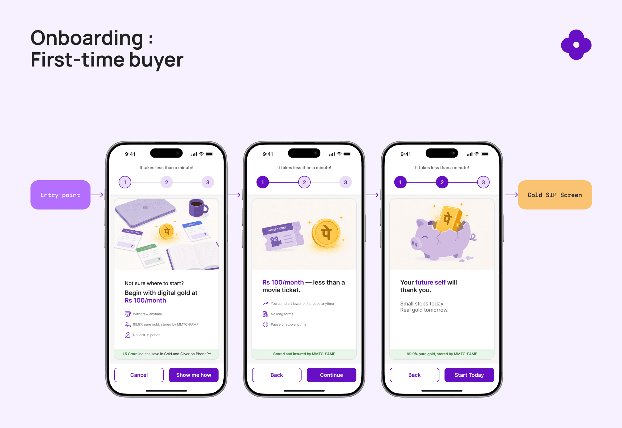
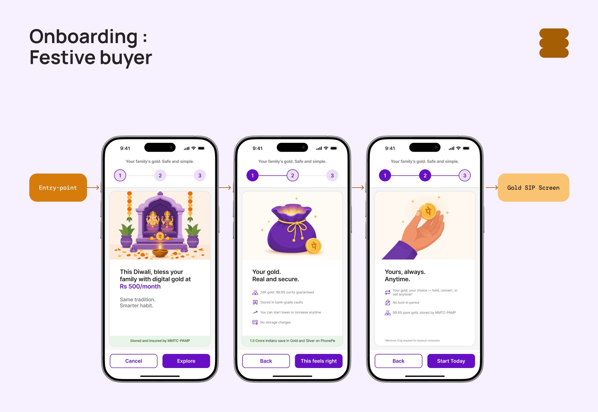
The research narrowed to two people. A First Time Buyer, young, early career, tier-1 city, never invested in anything and finds the whole idea intimidating. And a Festive Buyer, older, settled, tier-2 city, who's bought physical gold for years and sees no reason to trust a version they can't keep in a locker. Different fears, same root, neither trusts what they can't see.
what level this layer sits at
The onboarding answered that with two tailored flows, three screens each, built to prove the gold is real, safe, and withdrawable. Built entirely by hand, no AI in the product itself, onboarding was Level 1 on the workshop's ladder, fully manual. This layer is Level 2, manual plus AI.
→ Read Part 1 & 2: The Onboarding
→ Try the onboarding prototype
→ View the FigJam file
what kind of AI this actually is
Before the build, it's worth being clear about what this layer is, because AI work is easy to oversell and an oversell is easy to see through.
This isn't agentic AI, it never acts for the user. No money moves, nothing gets set up or sent. And it isn't generative UI, the layout is fixed. I designed every screen, even the graph is a component I built, PAI only feeds it data.
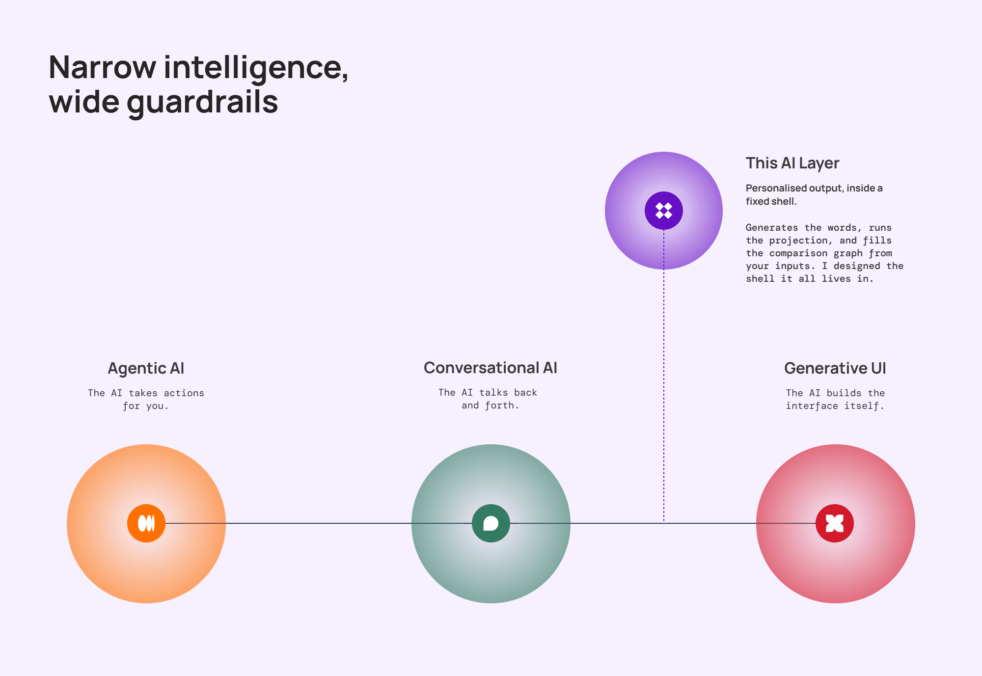
What it does is narrower, on purpose. PAI generates personalised output from who the user is and what they enter, the greeting and headline in the interceptor, the projection and comparison graph in the estimator. Everything around that output is a fixed shell with hard rules about what's allowed inside. Narrow intelligence, wide guardrails.
That's the right shape next to money and compliance, where being trustworthy matters more than being clever. And narrow is a choice, not a limit, PAI is scoped to one job here, but it wasn't built as a one-off. More on where it could go at the end.
splitting it into two.
one instinct, one decision
This started with one instinct, a cancel shouldn't be a dead end. Show the user something before they go. The pattern has a name, a soft exit, or exit intent, catching someone right as they're about to leave instead of letting them drop off cold.
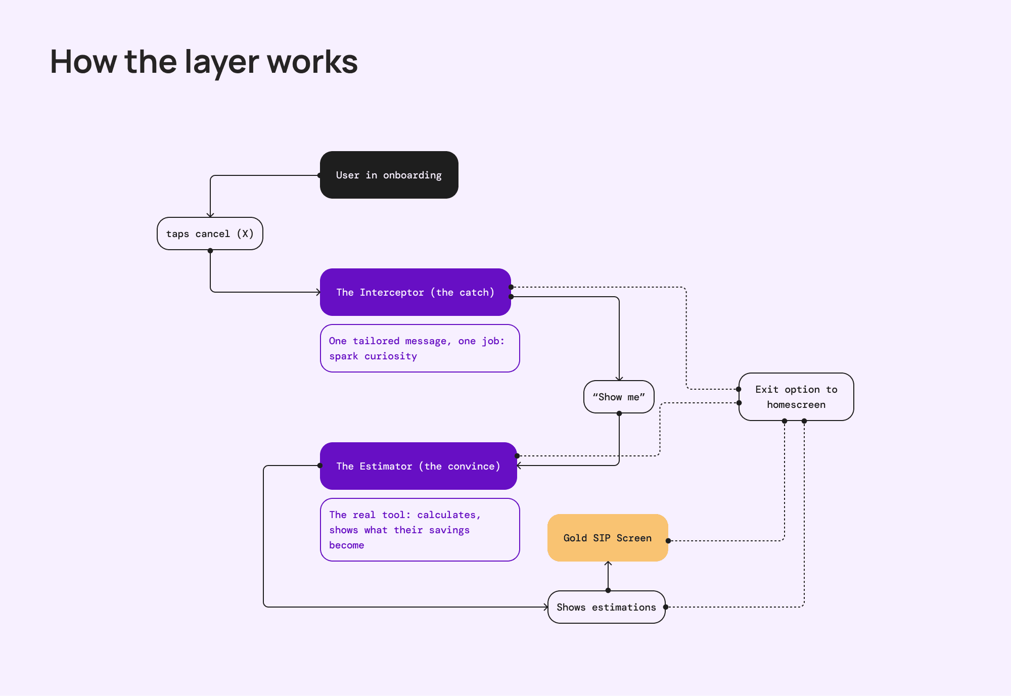
The decision that shaped everything was splitting that soft exit in two. The interceptor catches the cancel, its only job is to spark enough curiosity to get someone to the estimator. The estimator does the convincing. Kept separate, each stays sharp at one job, instead of cramming a nudge and a full tool into one popup that does neither well.
the model, and the data it sees
Both features run on the same engine. They call Claude through an API with a tightly written system prompt, no custom model, nothing trained in house. The logic lives in the prompt, which keeps scope realistic and lets the model be swapped later without rebuilding anything.
I picked Claude over GPT, Gemini, and Grok for one reason, this job isn't about creativity, it's about following rules, an emotional tone in the interceptor, tight numerical guardrails in the estimator, both inside long, constraint-heavy prompts. Next to money and compliance, the rule-following model wins.
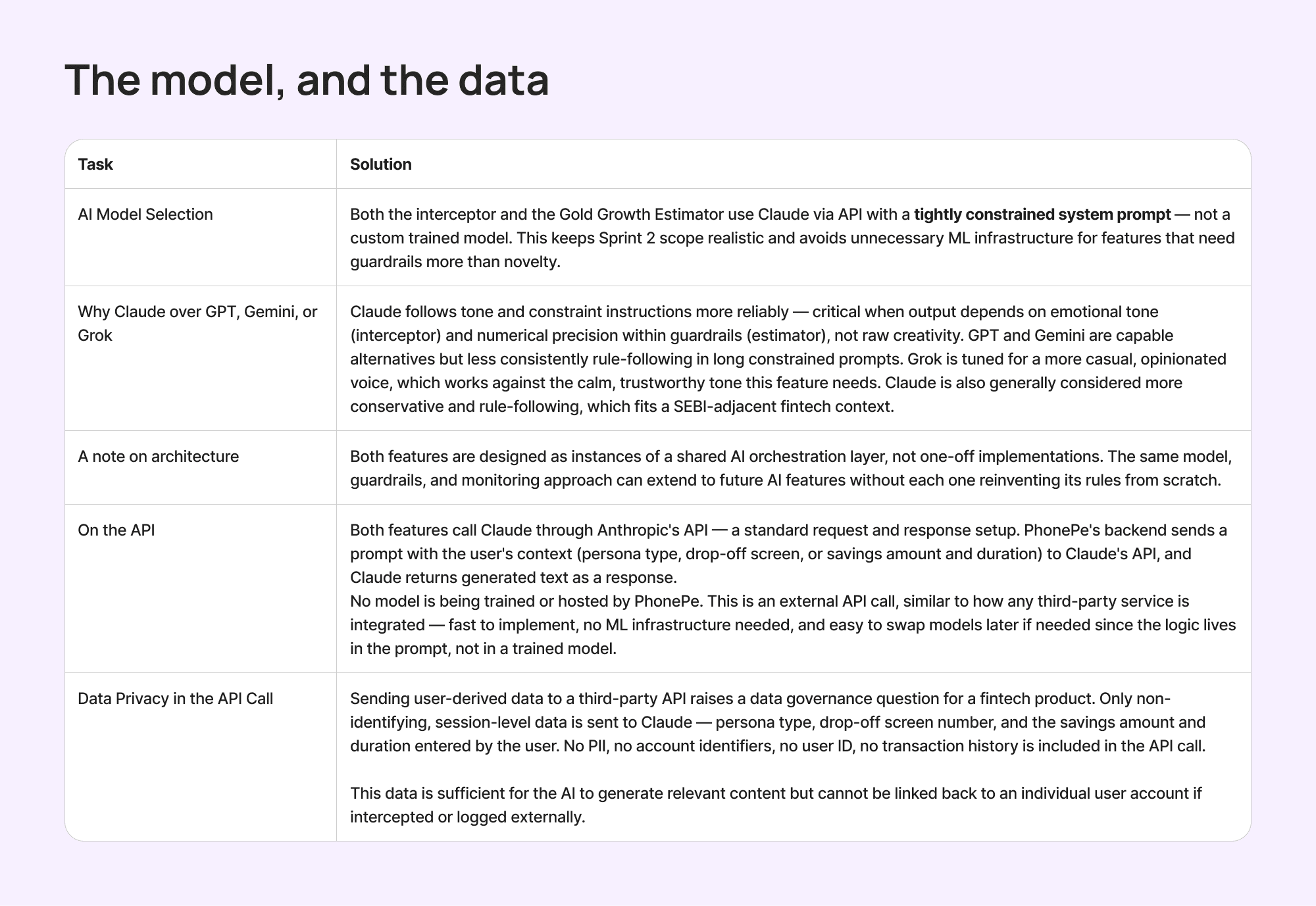
The data going out stays thin, persona type, drop-off screen, and for the estimator, the amount and duration. No name, no account ID, nothing traceable to a person. And nothing generated hits the screen unchecked, every response is validated first. Break a rule and it retries once with the exact problem named, fail twice or run long, it drops to a safe pre-built fallback.
the interceptor.
the exit that isn't a dead end
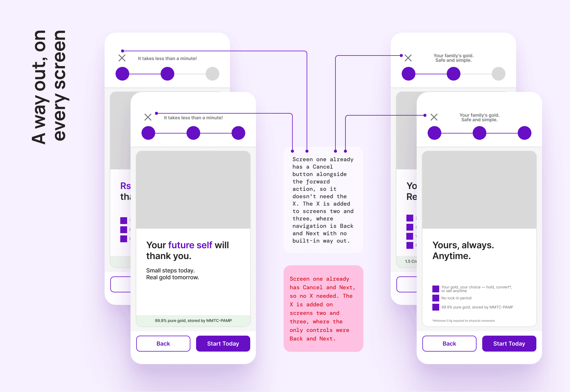
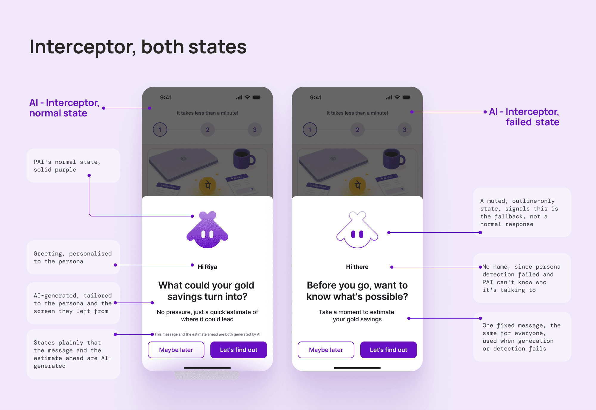
The interceptor starts with one small addition to the onboarding screens, a persistent X in the top-left corner. Navigation stays as it was, Back and Next at the bottom for moving through the screens. The X adds a separate way out, on every screen. And it isn't a plain close, tapping it triggers the interceptor.
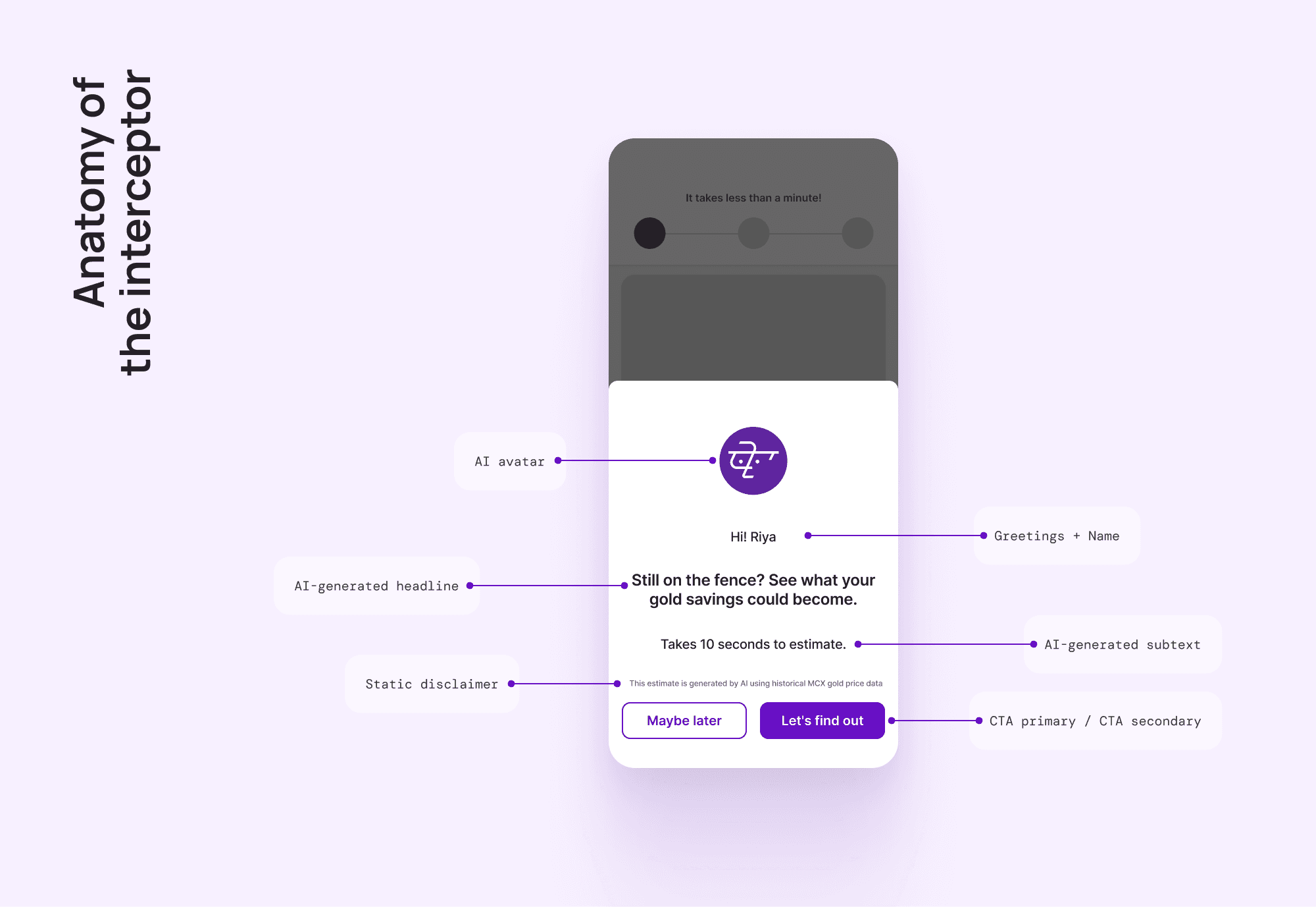
This is the first place you meet PAI, the AI assistant built for this layer. It writes the nudge, and later runs the estimator. How it got its name and face comes later.
Leaving and navigating are two different intentions, so they get two different controls. Back moves you around inside the flow, the X says you're done, the exact moment worth catching. Not with a wall or a guilt trip, just one more question worth pausing for. And because the X sits on every screen, the interceptor always knows which screen the user left from, a signal PAI uses to tailor what it says.
rules before copy
I didn't start by writing interceptor messages. I started by writing what they couldn't be. It's easy to write a line you like and then invent reasons it's fine, doing it the other way meant every generated line had to clear a fixed bar before it earned its place.
Tone came first. Warm, curious, never pushy, no urgency, no guilt, no exclamation marks. This is someone about to walk away, and the fastest way to lose them for good is to make the exit feel like a trap.

what the copy can never contain
Rupee figures, percentages, or gram values. Numbers are the estimator's job, and putting them in the modal steals its thunder and risks a compliance issue.
Comparisons to other financial products, no FDs, stocks, or mutual funds.
"Guaranteed," "assured," "fixed returns," or any certainty language.
Negative comparisons between digital and physical gold, in either direction.
what every line must do
End on a question. A question invites, a statement just informs.
Talk about gold savings generally, never a specific amount.
Reflect the persona and the exact screen they left from.
Use the word "estimate," so the offer is concrete, come see the number, not a vague come back.
The modal has exactly one job. Spark enough curiosity to get someone to the estimator. It doesn't convince, it doesn't inform, it doesn't sell. It opens a door.
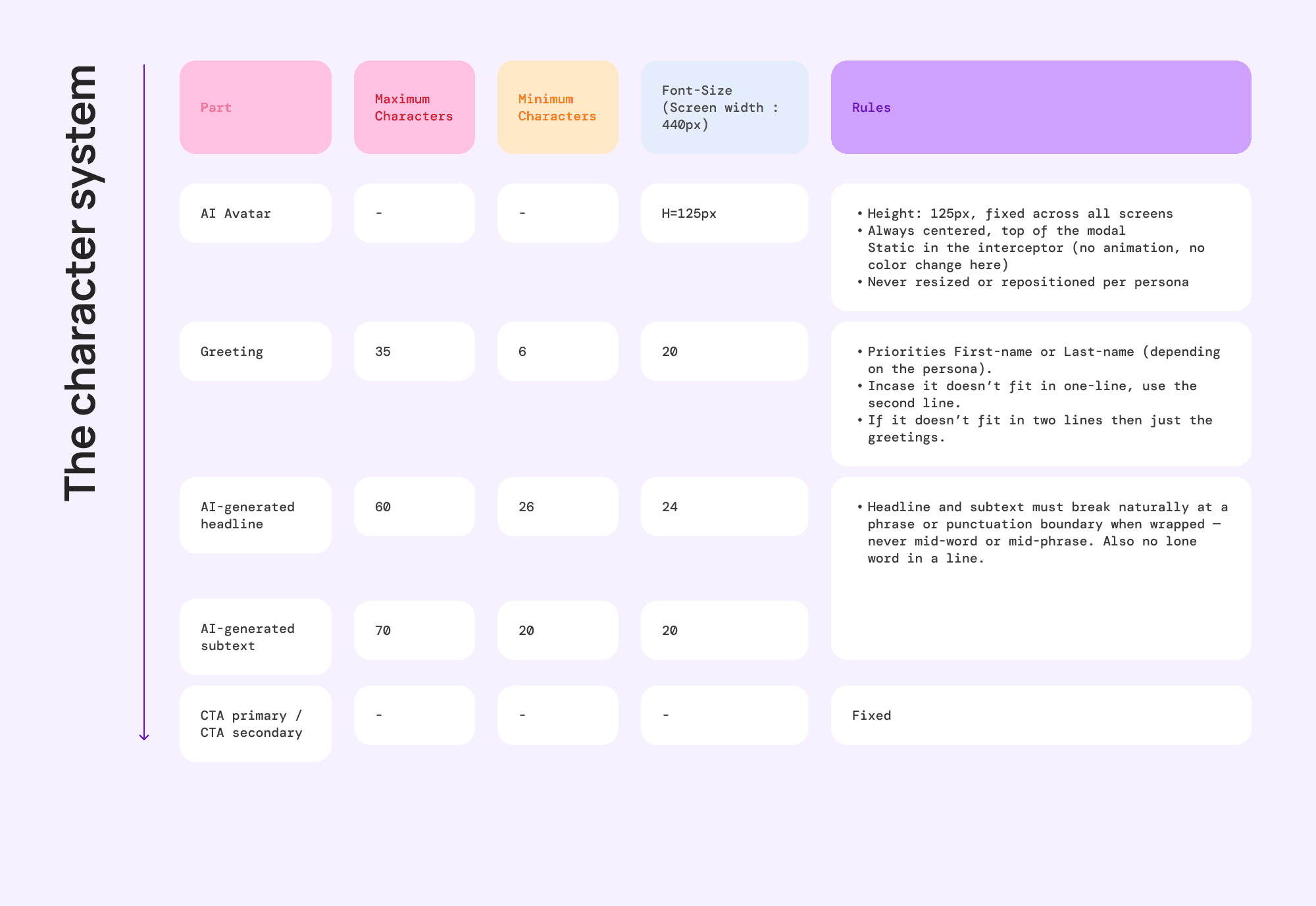
There were physical limits too. Each slot had a fixed character range so the generated copy always fit the modal, and the greeting was built to degrade gracefully, if a name ran too long, it dropped to a second line, then dropped the name entirely rather than break the layout.
when the first pass sounded like a template
With the rules set, I had the AI generate the first full round of copy. Six modals, both personas across all three screens. On their own, each one looked fine.
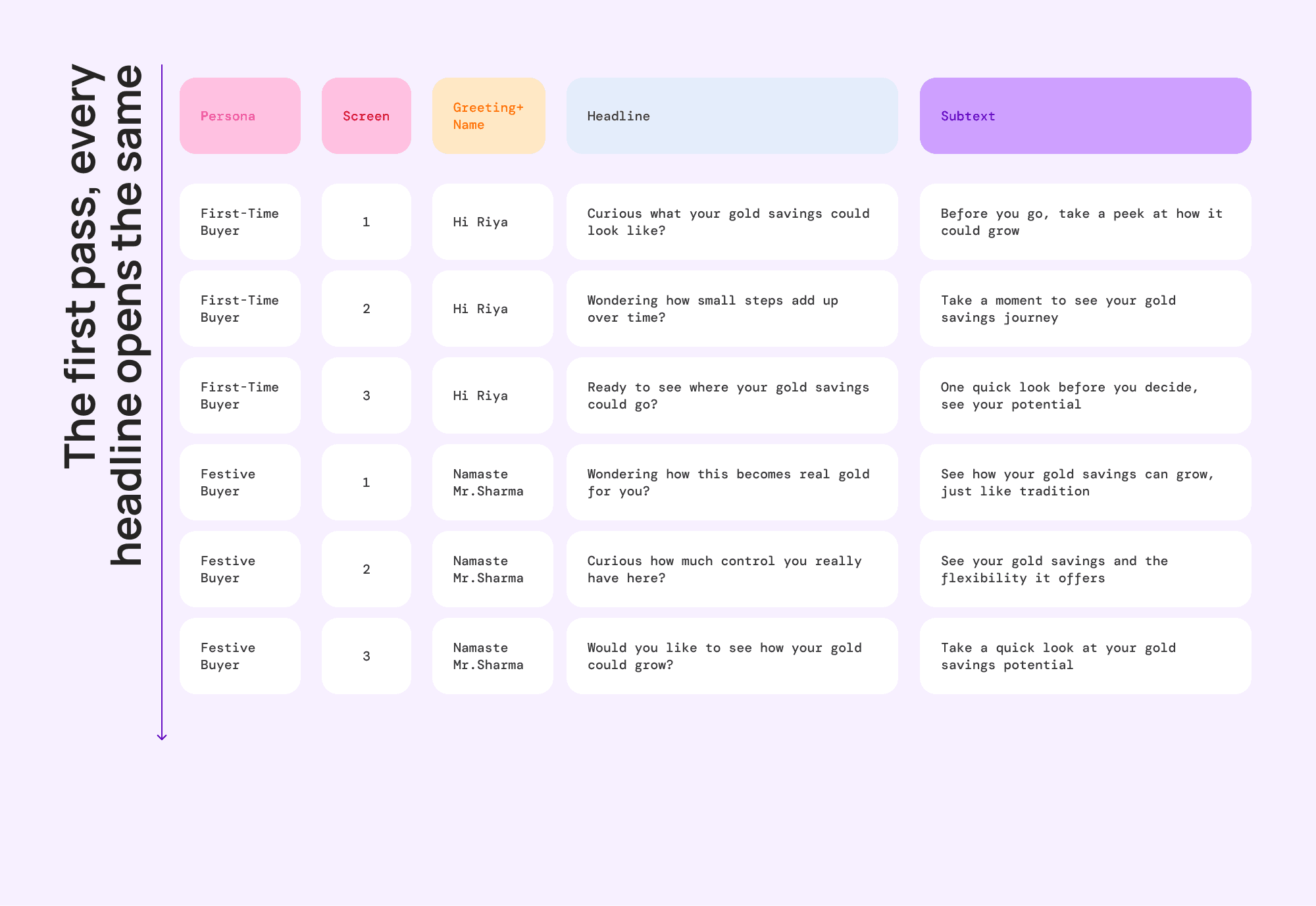
Lined up together, the problem was obvious. The headlines all opened the same way, "Curious what your gold savings could look like?", "Wondering how small steps add up?", "Ready to see where your gold could go?" Curious, Wondering, Ready. Read one and you'd read them all.
There was a second issue hiding in the greetings. The Festive Buyer's greeting came back as "Namaste Mr. Sharma," mixing a Hindi opener with an English honorific in the same breath. A small thing, but it's the kind of detail that quietly tells a user this was machine assembled, not written for them.
Neither problem was a copy problem. Both were rule gaps. So I went back to the guidelines and added the fixes there, not to the copy.
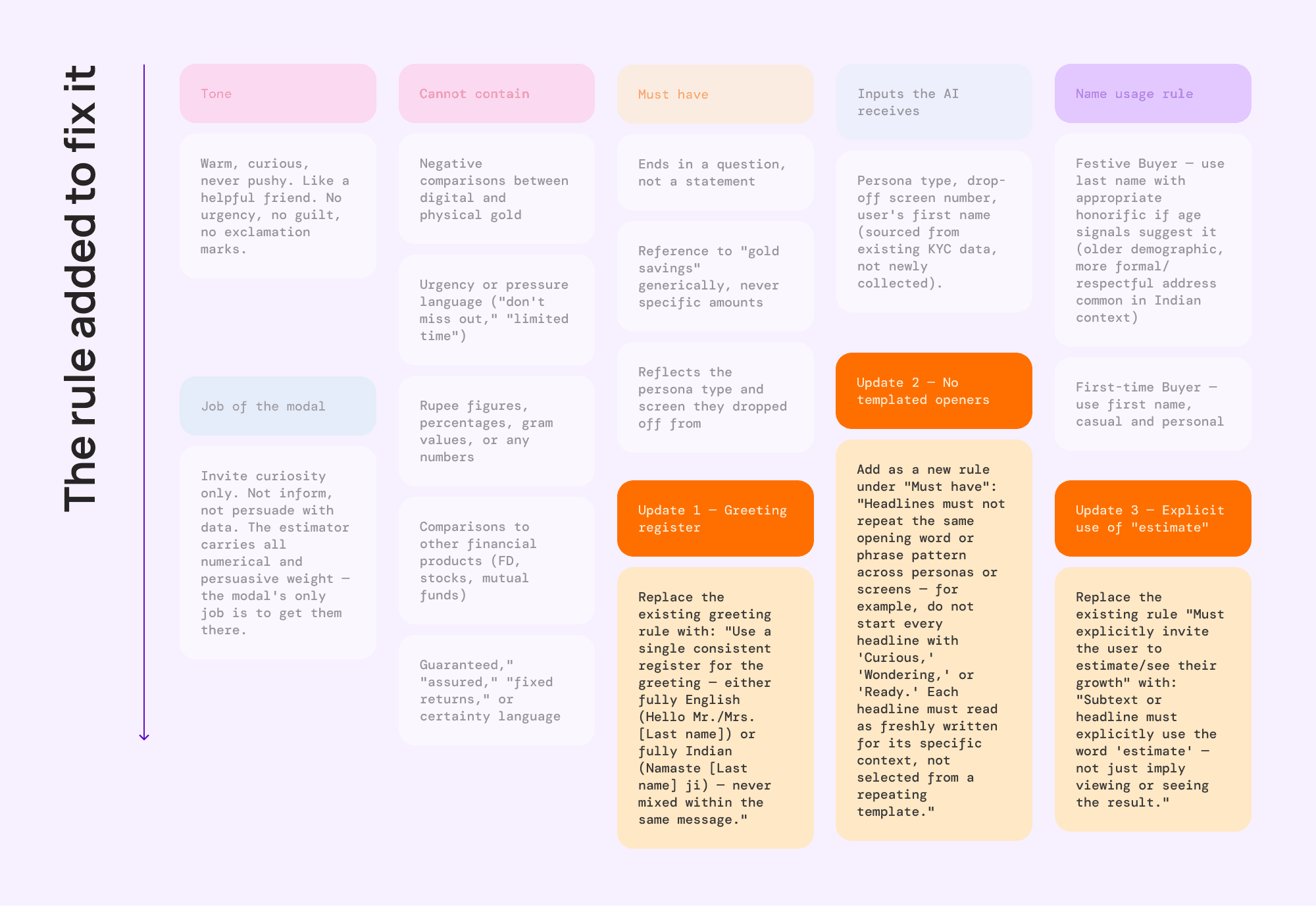
Three updates went in: no templated openers, headlines can't reuse an opening word or structure across personas or screens. One consistent greeting register, fully English or fully Indian, never mixed. And explicit use of "estimate," the subtext or headline has to actually say it.
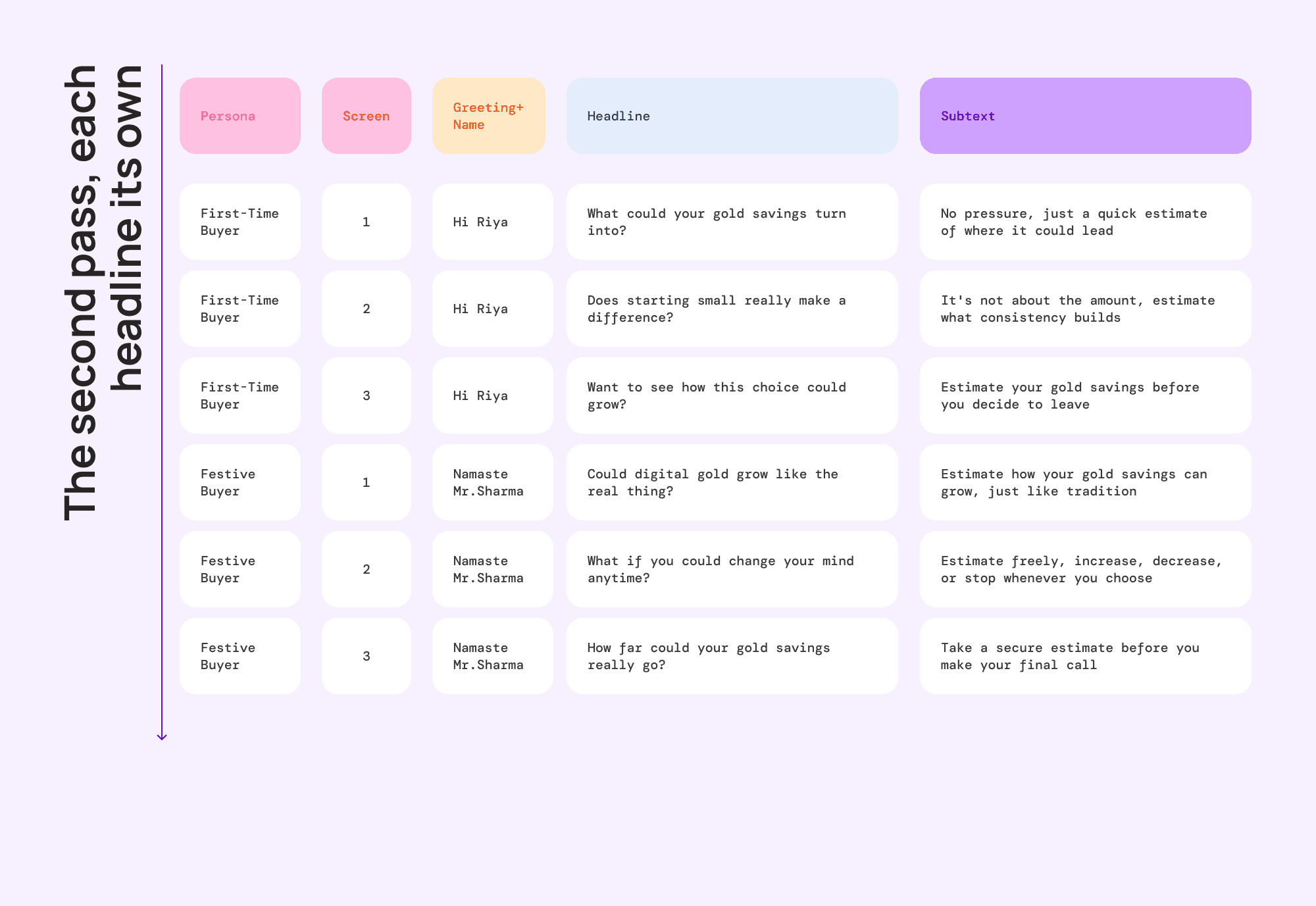
The second round fixed all of it. Same rules, same constraints, but now every headline opens differently and every greeting holds one register. The fix lived in the rules, so it holds for any copy the system generates later, not just these six.
what the interceptor remembers
Most of the interceptor is stateless, someone hits the X, the AI reads the persona and drop-off screen, writes a nudge, done. But one case made me think about memory. What if a user leaves, comes back, and goes to leave again at the same spot, should the interceptor say the exact same thing?
It shouldn't. A first drop-off is someone still deciding, a repeat is someone who's walked away here once already. So the system passes one more input, has this user hit the interceptor before, yes or no.
The real decision was the boundary, what it deliberately doesn't remember. It knows the user hesitated before, it doesn't store what they saw last time. "This is a repeat visit" is useful context. "Last Tuesday we showed them headline four" is surveillance, and it buys nothing.
the estimator.
the reframe that fixed it
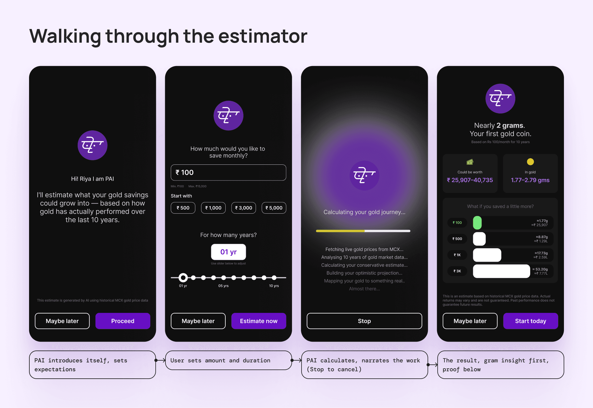
The estimator does one thing, you tell it how much you'd save each month and for how long, and it shows what that becomes in gold. The hard part was what "shows" means.
The first version just showed the number. Rs 100 a month for ten years, roughly 1.77 grams. Accurate. Completely dead. 1.77 grams means nothing to someone who's never bought gold, no feeling, nothing to picture.
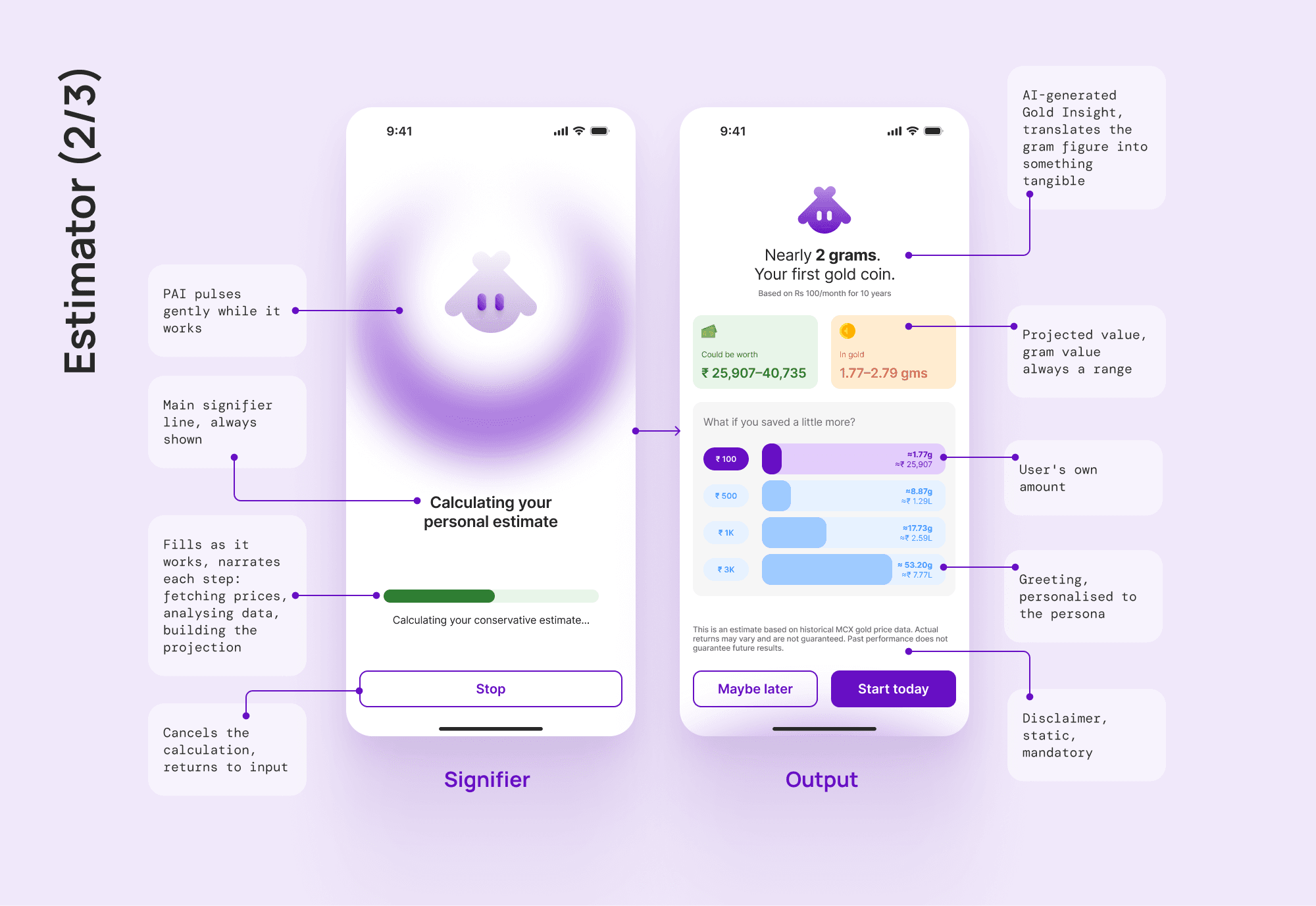
The fix was to lead with what the number is, not the number. The same 1.77 grams became "Nearly 2 grams. Your first gold coin." It's the iPod move, not "5GB of storage" but "1,000 songs in your pocket." Same fact, translated into something a person actually wants. That reframe is the spine of the entire estimator.
the projection model, and six dead ends
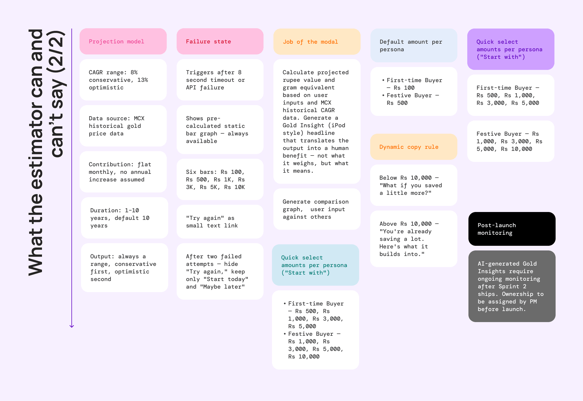
Behind that "nearly 2 grams" line is a number, and the number has to be honest. Getting to one I could defend took six tries. Five were wrong, and the wrong ones are the point.
It started dead, multiply the monthly amount by the duration, no growth, Rs 100 a month came out as 0.41 grams, accurate and meaningless. The next couple of tries were versions of cheating, a round 10% return I'd invented because it sounded fair, then a model that assumed the user raises their contribution every year, which is projecting user behaviour, not gold performance. Both got cut.
Then I made an actual mistake, I compounded the growth monthly instead of annually, and the numbers exploded, a Rs 500 a month start ballooned to lakhs a month within a few years. I caught and killed it fast, but I'm keeping it in the write-up, because a process with no wrong turns in it isn't a real process.
Then two things fixed it for good. First, the reframe, leading with meaning instead of grams. Second, real data, I replaced the invented 10% with the actual historical range from the MCX, the exchange professional traders use, Indian gold has returned roughly 8% to 13% a year over the last decade. Last call was the default, the five year story is modest, the ten year story is compelling, so ten years became the default.
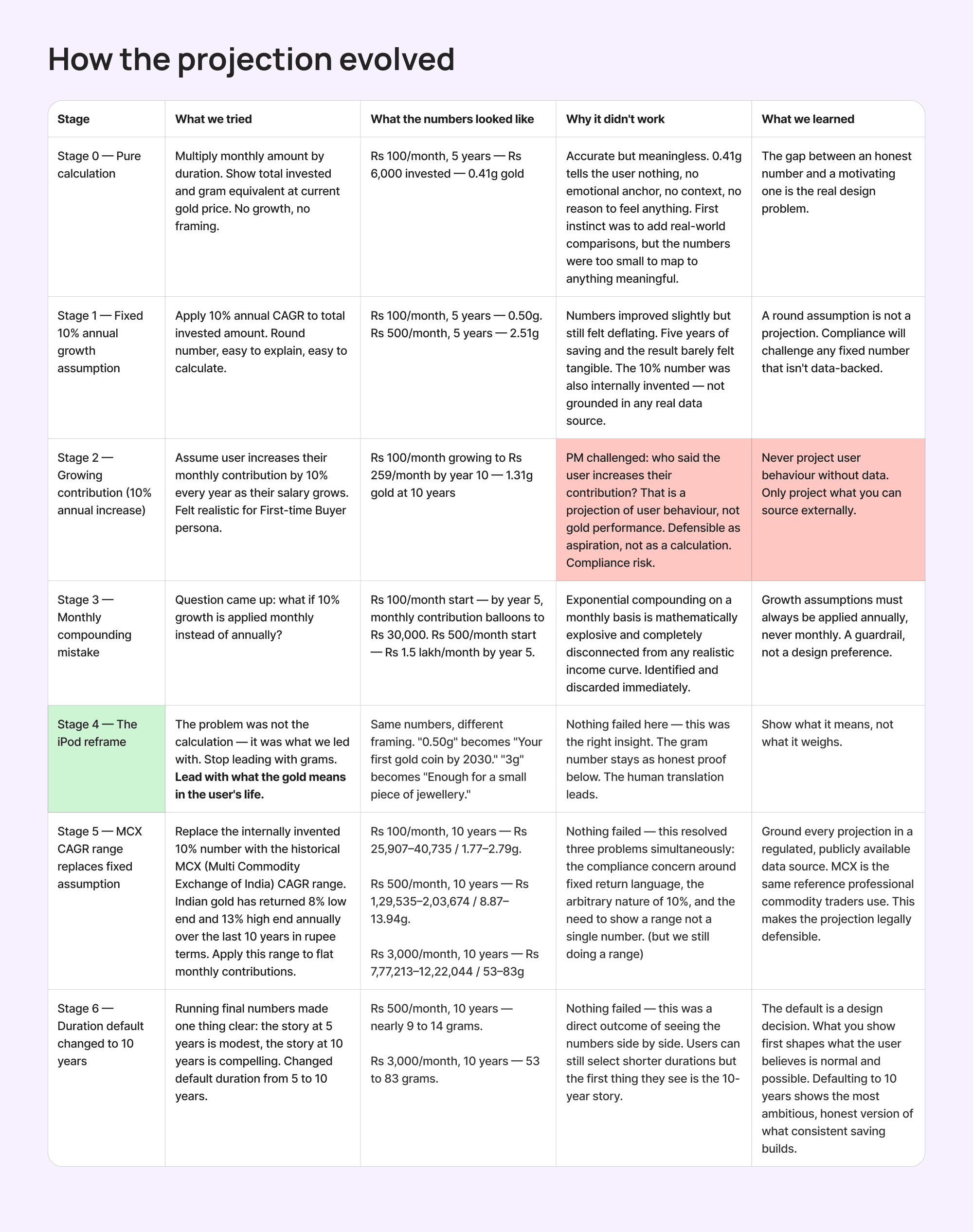
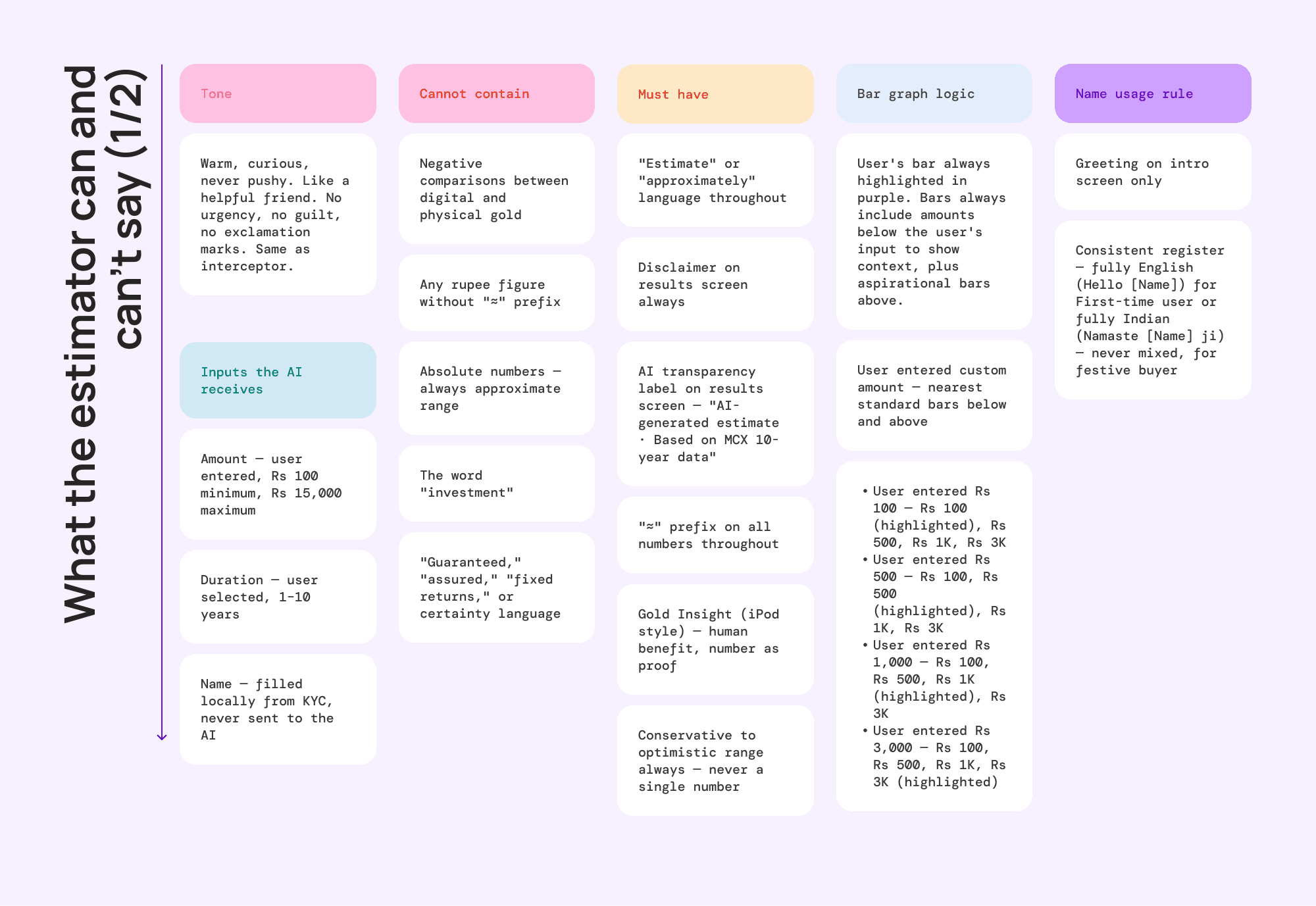
The compliance safety fell out of all this rather than being bolted on. Every number shows as a range with an approximate symbol, the SEBI disclaimer sits on every result, and words like "guaranteed" never appear. Getting the projection honest was getting it compliant.
inputs I verified, not guessed
The estimator takes two inputs, an amount and a duration, and it would have been easy to pick reasonable-looking limits for both and move on. I checked them instead.
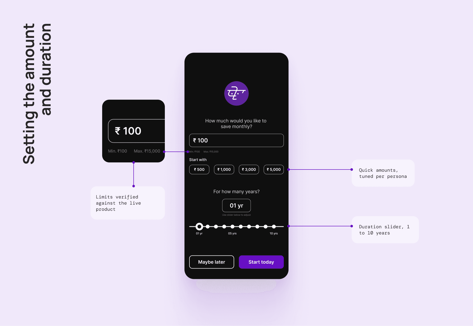
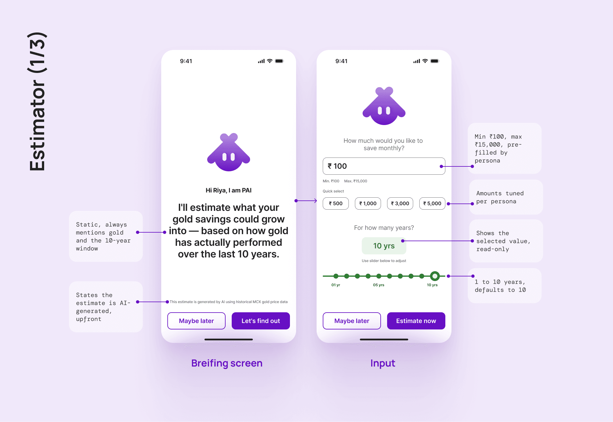
The amount runs from Rs 100 to Rs 15,000 a month. The floor is the platform minimum. The ceiling is PhonePe's actual maximum for a monthly gold contribution, confirmed against the live product.
Duration is a slider, one to ten years, on purpose. A text field would let someone type 3.5, or 40, or a negative number. The slider makes a whole category of bad input impossible instead of catching it after the fact.
The quick-select amounts change by persona too, the First Time Buyer sees Rs 500, 1,000, 3,000, 5,000, the Festive Buyer sees Rs 1,000, 3,000, 5,000, 10,000.
the graph that talks back
A single number sitting alone has the same problem the raw grams did, no context. So the results screen doesn't show one number, it shows a small bar graph, your amount, highlighted, sitting next to a few higher amounts.
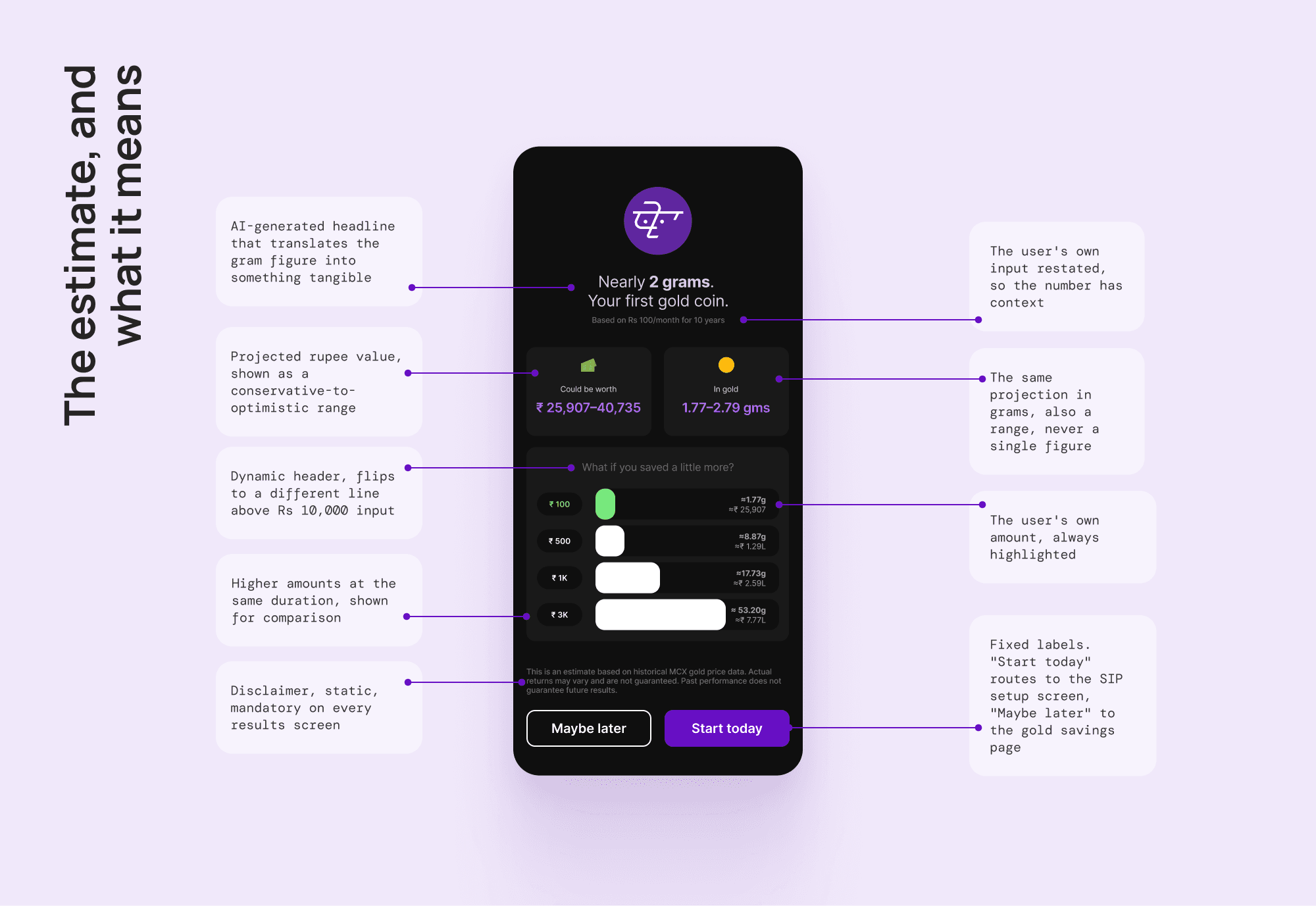
That reframes the whole thing. Instead of "here's what you'll have," it becomes "here's where you're starting, and here's how much faster it grows if you do a little more." The header above the graph adapts too, under Rs 10,000 a month it reads "What if you saved a little more?", cross Rs 10,000 and it flips to "You're already saving a lot. Here's what it builds into."
testing the estimator's rules
The interceptor's copy got tested across six contexts. The estimator needed the same check. So I ran both personas across three amounts each, all projected over ten years, the default, focused on the Gold Insight line and the two figures under it.
the signifier, and the fallbacks.
the wait as its own moment
While the estimator works out your number, something has to show it's alive and doing something. My first version wasted the moment, a plain loading spinner, which only says one thing, the system is busy.
So I rebuilt the wait as its own moment. PAI sits centre with a soft purple glow that pulses while it thinks, a progress bar fills, and a line of text cycles through what's happening, fetching live gold prices, analysing ten years of data, building your projection.
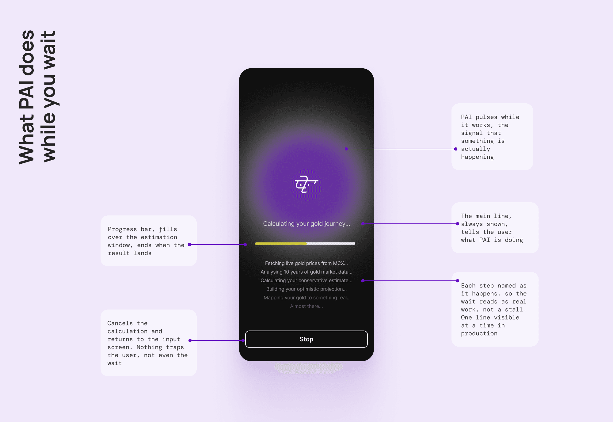
There's also a Stop button, you can stop the calculation any time and go back to the input screen. One correction on timing, I first set a four second window, too tight for a real calculation to finish in, I widened it to eight.
when the estimator can't answer
Every AI feature needs a plan for when it can't do its job, and this layer routes two different failures to the same safe place on purpose.
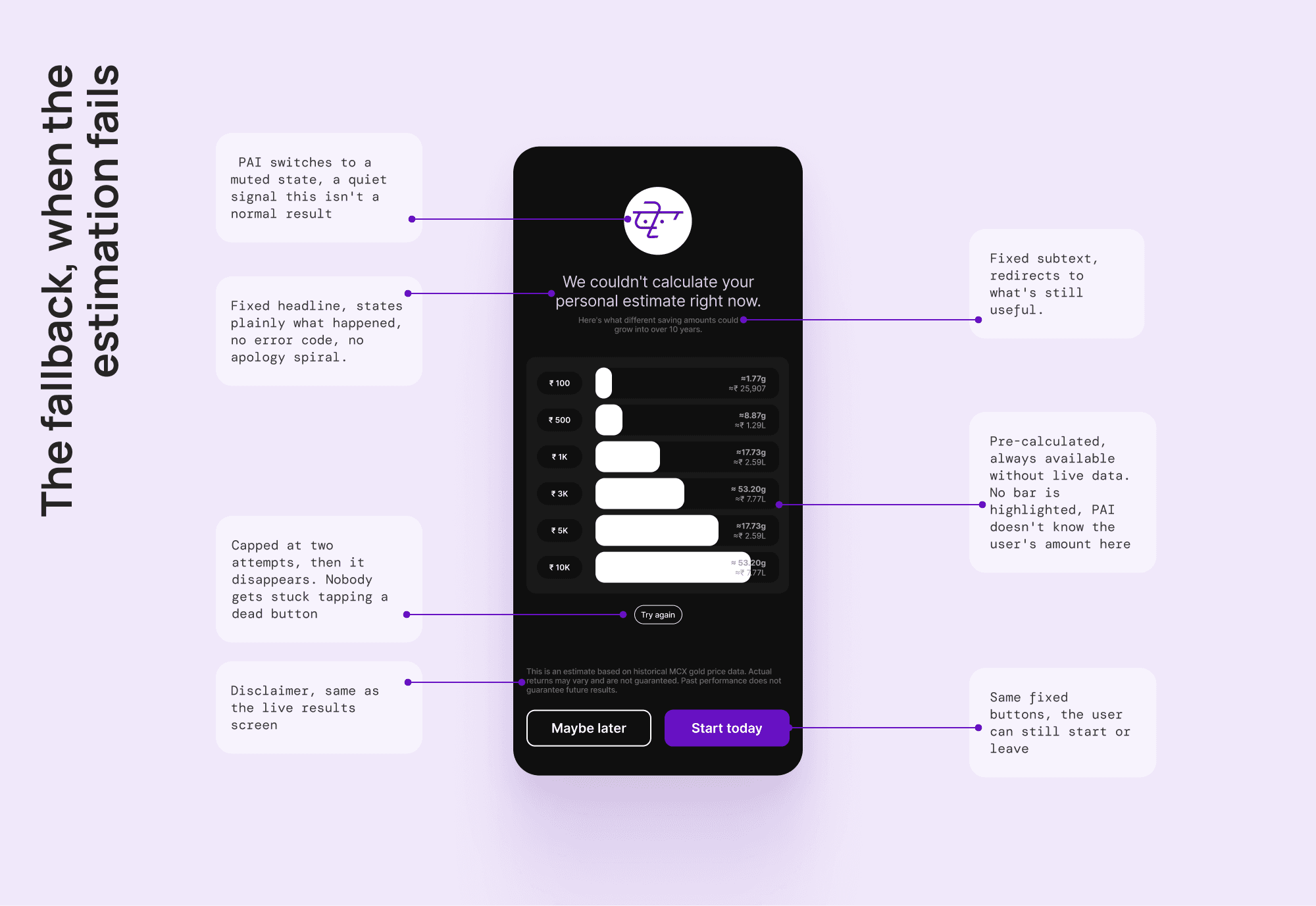
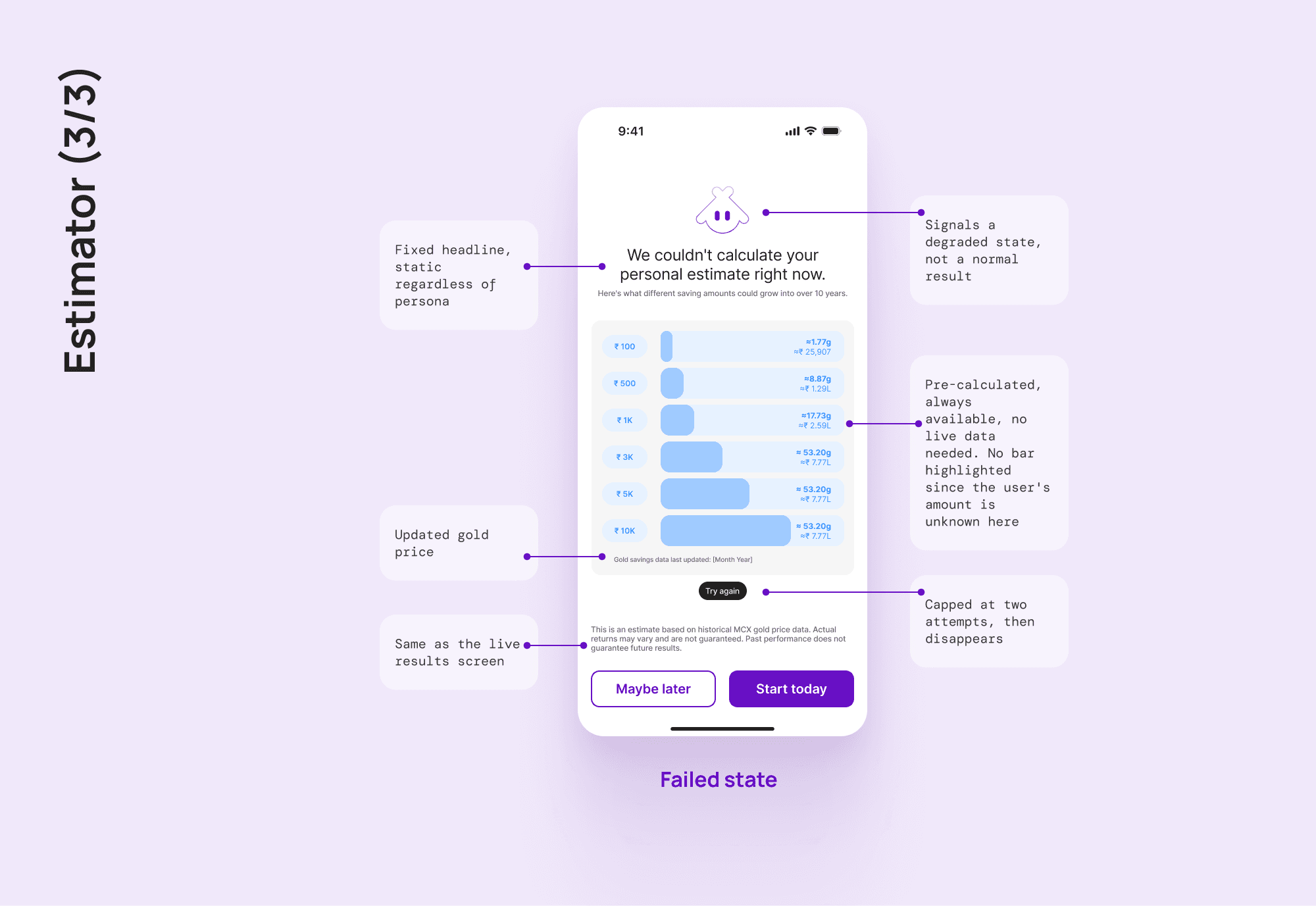
When the estimator's live calculation fails, it drops to a static, pre-calculated graph, six fixed amounts, no live data needed. PAI's glow goes muted grey, and "try again" is capped at two attempts.
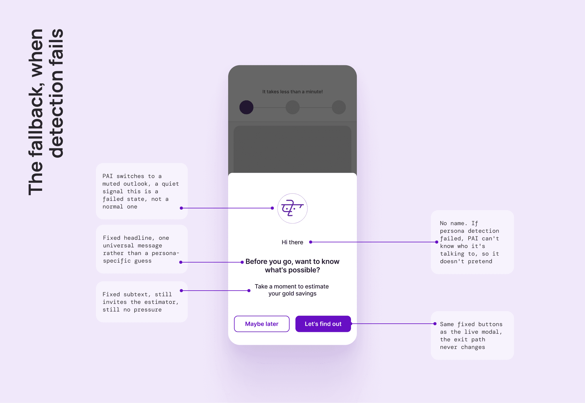
The interceptor's fallback is the interesting one. If persona detection fails, PAI can't know who it's talking to, so there's one universal fallback, deliberately persona-agnostic, it even drops the name and opens with "Hi there." That same fallback catches a second failure too, if generated copy fails validation twice, the system shows the safe static version.
proving it works.
proving the personalization is real
"AI personalised" is easy to claim and easy to fake. So it's worth showing the actual system underneath the interceptor's copy.

Two personas, three drop-off screens each, gives six distinct situations. A First Time Buyer who leaves on screen one hasn't committed to anything yet, so the nudge stays light and curious. The same buyer who makes it to screen three and still leaves is the strongest hesitation in the whole flow, so that nudge has to work the hardest. Six cells, six emotional reads, six messages.
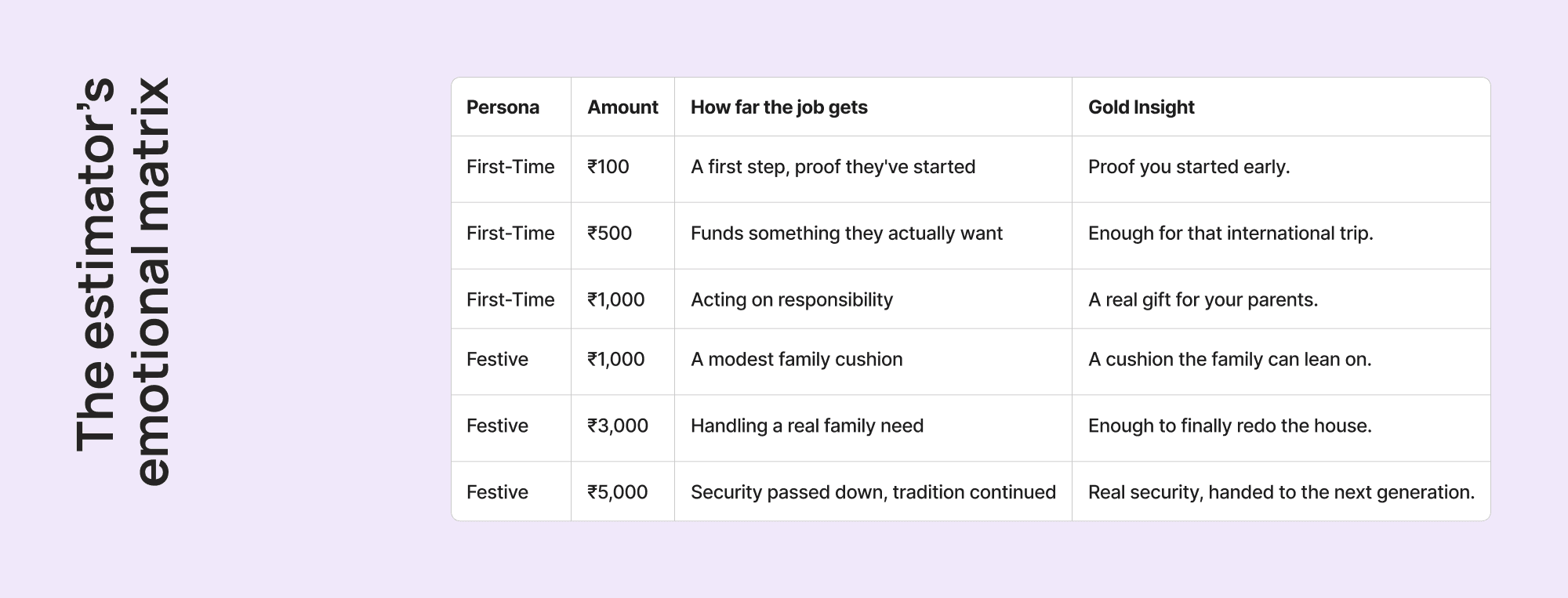
The estimator personalises too, just differently. It runs on the same Jobs To Be Done from the onboarding research. The job belongs to the person, not the amount, a First-Time Buyer wants to start building and feel responsible whether they save Rs 100 or Rs 1,000. So the Gold Insight scales the payoff, not the person.
the reviews.
PM review, three decisions worth telling
Like the onboarding reviews, this one was simulated, run as a senior PM at PhonePe with fintech and compliance experience. It ran across twenty decisions, and what's telling is how few were purely design calls, ownership landed on Product, Engineering, Legal, and the Data team as often as on Design.
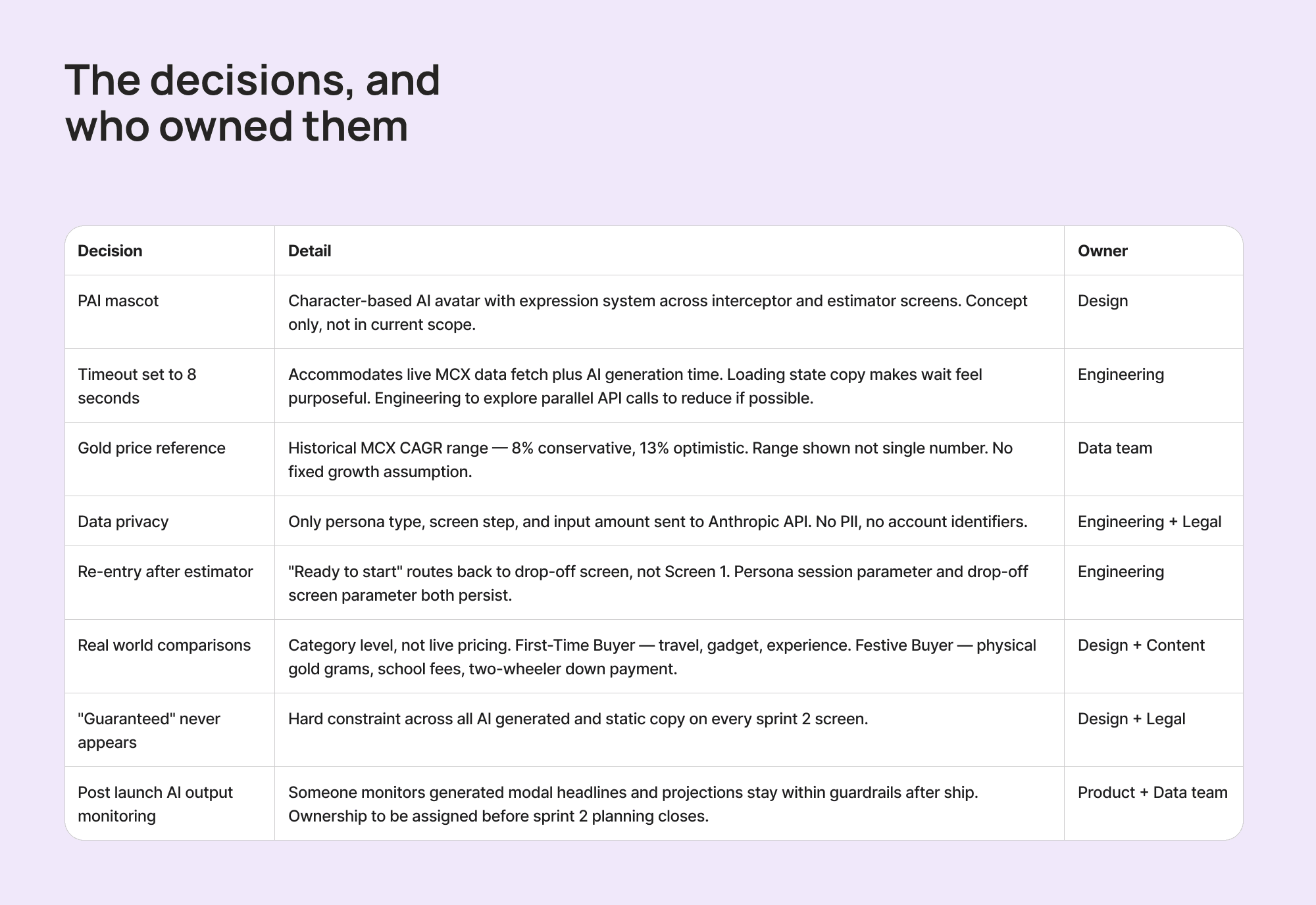
A dependency I didn't need, I'd planned for the estimator to pull live gold pricing for its comparisons, the PM flagged it as unnecessary, the comparison amounts don't move minute to minute, so it dropped to category-level comparisons.
A blind spot I'd missed, "Ready to start" was routing users to screen one by default, not back to the screen they'd actually dropped off from. So the drop-off screen now persists as a session parameter, and the user returns exactly where they left.
One I'm leaving open, who monitors PAI's output after launch, Product or the Data team? Ownership never got settled before the review closed. It stays open, on purpose.
EM review, four decisions worth telling
I ran this the same way, simulated, this time as a senior engineering manager weighing every piece against what could actually ship in one sprint. It came back across eighteen items, and unlike the PM review, this one didn't wave things through.
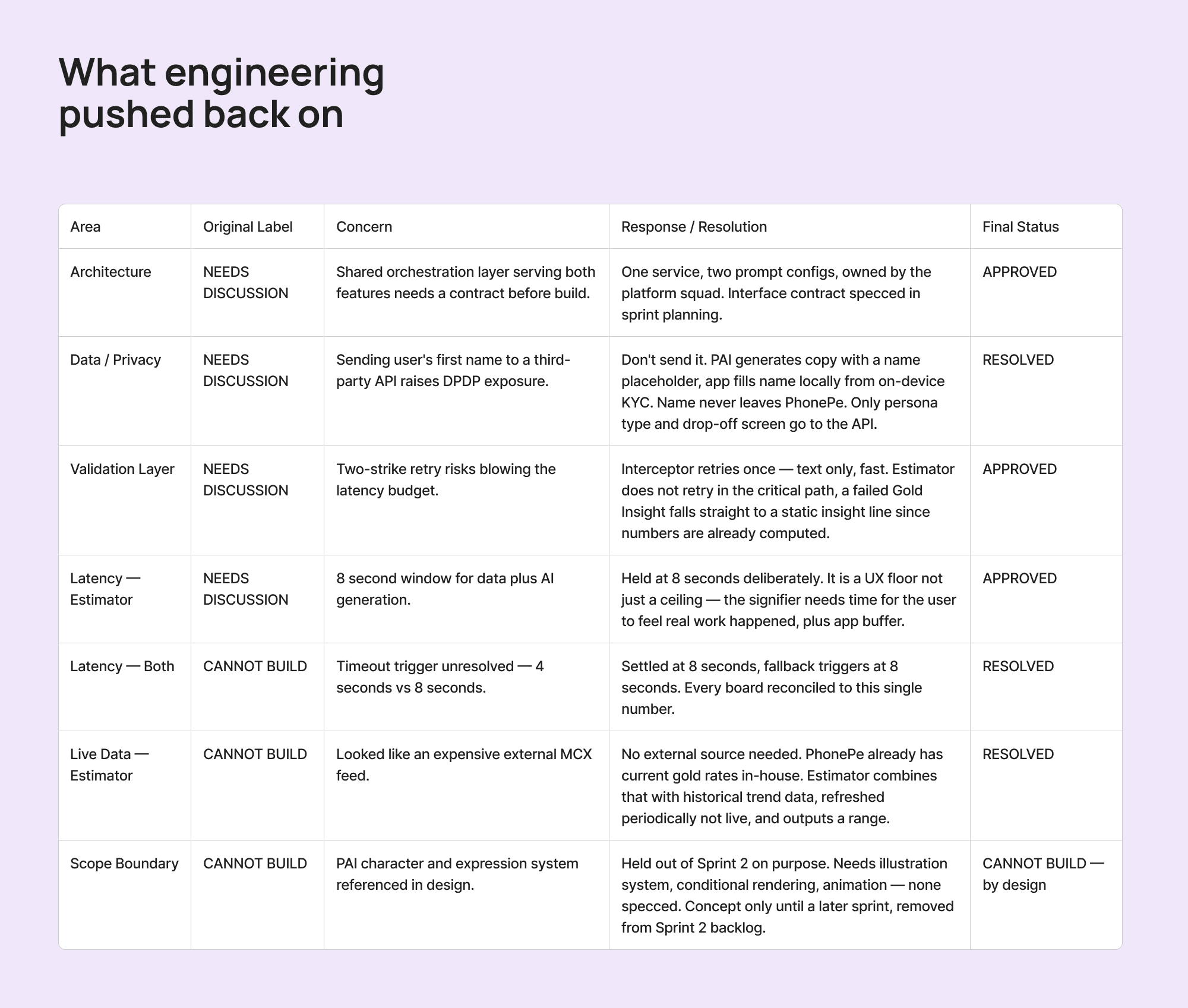
The data dependency that looked scarier than it was, on paper the estimator needed live gold price data, but the projection runs on historical returns, not today's price alone, and PhonePe already has current gold rates in-house. Nothing external to build.
The timeout, held on purpose, my specs had drifted between four and eight seconds, the EM refused to build against a moving number. We locked it at eight, which isn't just an engineering ceiling, it's a floor too, the signifier needs that time to land.
The privacy problem I'd walked past, my plan sent the user's first name to the API so PAI could greet them by name. The EM flagged it against India's data protection law. The fix was better than a consent form, don't send the name at all, PAI writes the greeting with a placeholder, the app fills in the real name locally. The name never leaves PhonePe.
One clean boundary came out of it too, PAI as a character, the expressions, the animation, got ruled explicitly out of this sprint's build. Not cancelled, just named as concept-only.
from gray to gold.
giving PAI a face
PAI had been doing all the work, writing every nudge, running every estimate, and up to now it was just a name. Hi-fi is where it got a face.
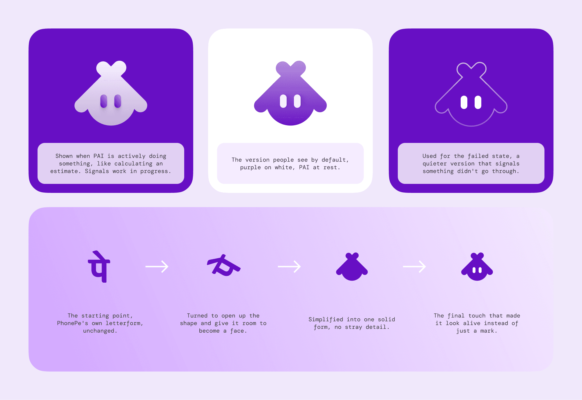
The name does a few things at once, PAI is P for PhonePe and AI for what it is, and it reads like Pi, which fits a product built on numbers. The face I built from PhonePe's own Pe letterform with a pair of eyes added, so PAI looked like it grew out of the brand, not a mascot dropped in from outside. The version I kept is white on purple, chosen because it reads cleanly against the dark screens PAI lives on.
I planned five expression states, neutral, working, celebrating, apologetic, curious, then stopped short of a full face, no mouth. The eyes and the colour shifts carry the emotion, muted grey when something fails, a gentle pulse while it thinks. The rest is designed, noted, and left for later.
making it match the app
Lo-fi shipped in grays, and the reviews ran against it. Hi-fi is where those fixes landed and everything got its real skin.
The main job was to disappear into the app. Type, icons, spacing, and buttons all matched to PhonePe's existing system. For the illustrations, I fed real screenshots of the live app into the AI tools so the output matched their actual style, warm backgrounds, flat shapes with a little depth, gold the brightest thing in every frame, and the पे mark on every coin. The goal wasn't to look good on its own. It was to look like it had always been there.
the framework, filled in.
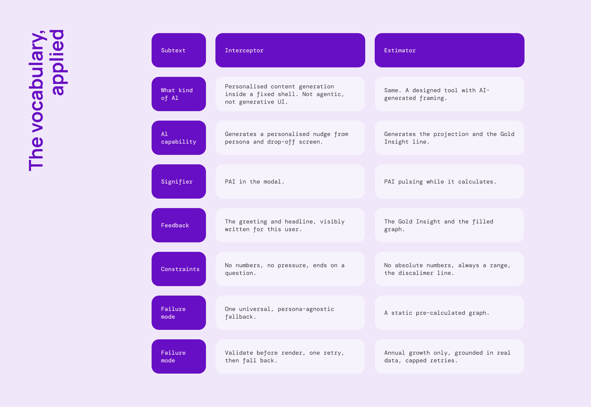
Throughout this, I've leaned on a working vocabulary for AI design, capability, signifier, feedback, constraints, failure mode, guardrails. Here's the whole thing in one place, answered for both features side by side. The point isn't the individual cells, it's that both features answer the same questions, that's what makes this a layer, not two loose features.
what I'd do differently.
A few honest gaps, because a case study that only lists wins isn't worth much:
It needs real testing, the interceptor and estimator are still early, the thinking holds, but they'd only prove themselves in front of real users, at scale.
The reviews could go deeper, I played both PM and EM, which sharpens the thinking but means I was arguing with myself.
Compliance deserves a deeper cut, I handled the obvious SEBI and disclosure risks, but a real fintech feature needs a much closer legal read than a solo exercise can give.
More could be systematised, the UI components and generation rules work, but a fuller version would tighten them into a more complete, reusable system.
I'd push the AI-prototyping further, I used AI throughout to move faster, there's room to lean on it more deliberately to prototype and test the whole flow.
None of this sinks the work. Knowing where the edges are is part of it.
closing.
Every decision in this layer traces back to one line. At the cancel moment, words have done everything they can, and the only thing left that can move someone is showing them something real.
The interceptor's rules, the estimator's climb from a dead number to a first gold coin, the two-strike validation, the name that never leaves the device, the monitoring question left honestly open, none of it is decoration. It all serves that one idea.
And this is where PAI is smallest. Right now it writes a nudge and frames a number, one job, carefully scoped. But the same layer could do much more, set up the payments you already make each month, notice where your money goes and suggest where a little could grow instead. The name was never meant for one feature. This, the cancel moment on a gold screen, is just the first place it earns its keep.
You can't talk someone into trusting what they can't see. But you can show them what it could become. That's what this layer does, and it's the smallest version of what PAI could be.
year
2026
timeframe
10-days
tools
Figma, Claude, Gemini, ChatGPT
category
AI Product Design/Concept
01

02

03

see also


