onboarding for people who don't trust digital gold
personalised onboarding for the Gold SIP feature on one of India's largest payment platforms.
00

problem
PhonePe has a Gold SIP feature. People land on it, and most leave without starting. That's not an awareness problem, it's trust. Digital gold has no physical form, nothing to hold, see, or check. In India, gold has always meant something you can verify with your hands, passed down, worn, kept somewhere safe. A number on a screen doesn't carry that same weight.
solution
Personalised onboarding, built around what the research actually revealed about each audience.
One naming note. This project was built and mostly written before I realised PhonePe now calls this Gold Savings, with the monthly version Monthly Gold Savings. Rather than rename everything, I've kept Gold SIP throughout, the common term for a monthly savings plan in India.
choosing who to design for.
the workshop this is based on
This project follows a process taught by Rajat Patel, ex-PhonePe, across two sessions of his Product Thinking Workshop. Session one gave me the problem statement plus two frameworks, JTBD and AIPSO. Session two was a live demo built with Claude, five personas, a question-prompt-output-review workflow, a simulated PM review, a simulated engineering review.
One line of his stuck word for word: "Generic onboarding optimizes for completion. Great onboarding optimizes for conviction."
The five personas and the JTBD groundwork came from that workshop. I didn't take them as given though, I ran my own interviews and worked the analysis myself, and landed close to where he had. Everything from there is mine, cutting five personas to two, the design calls, the PM and EM reviews.
To accommodate the FigJam assets here, boards have been redesigned and refined. You can view the full FigJam file by clicking this link. → View the full FigJam file
why diwali stays out of the first-time flow
The thing shaping the whole project was Diwali, the one time of year Indians are most primed to buy gold. But that pull only works on someone who already owns the ritual.
Here's the part that's easy to miss. Gold itself isn't foreign to a First Time Buyer, most grew up watching a parent buy it. What's unfamiliar is investing. Forcing a Diwali angle onto someone who hasn't earned that milestone yet would mean handing them a moment that isn't theirs, so I kept it out of that flow completely.
Scope stayed narrow too, onboarding only, starting the second a user lands on Gold SIP.
five personas, narrowed to two
Five personas came out of a structured exercise, Claude fed PhonePe's context and existing user data, then it got reviewed and refined instead of taken at face value:
First Time Buyer
Festive Buyer
Anxious Planner
Optimizer
Lapsed User
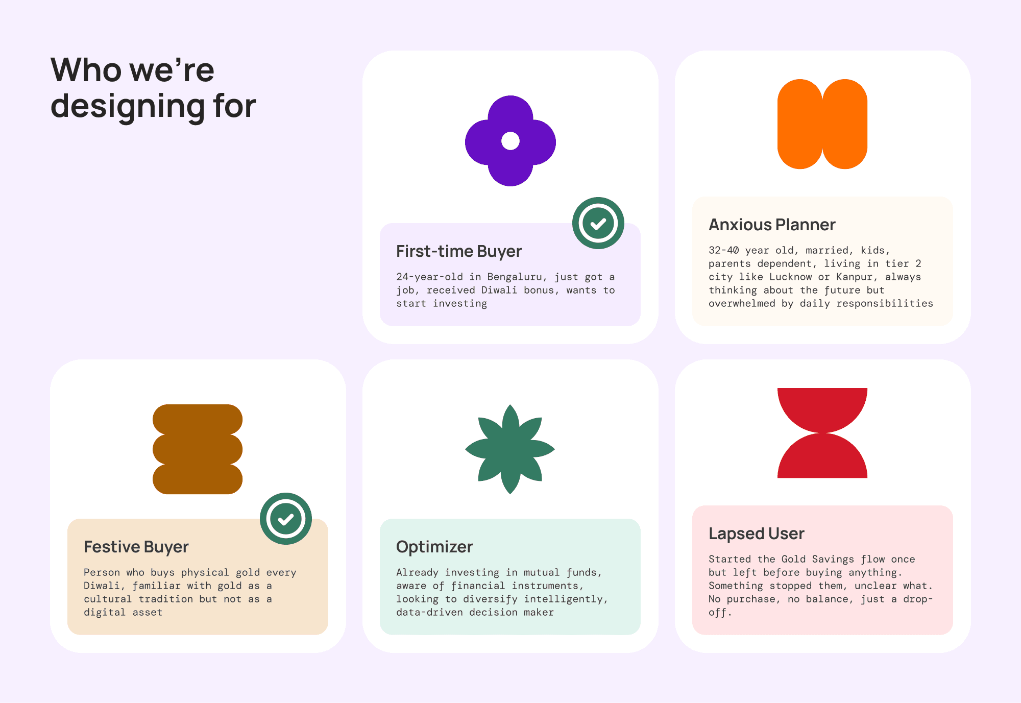
Designing well for all five would've meant designing well for none, so I picked the two sitting at opposite ends of the same problem. First Time Buyer skews tier-1, early career, never invested in anything. Festive Buyer skews tier-2, older, settled, already spending real money on physical gold every year. Neither has bought digital gold, for opposite reasons, one hasn't invested in anything at all, the other trusts only what they can physically hold.
why the other three didn't make it
I didn't drop the other three to make life easier. The Optimizer turned out to have a data problem, not a trust problem, exactly what the AI layer solves in the next case study, not onboarding. The Anxious Planner's blocker was decision fatigue, a different problem entirely. Keeping either would have blurred the contrast the whole project leans on.
what the research found.
how the research was done
Real interviews weren't possible on the timeline, so I used Gemini to generate three sub-personas under each buyer type, Riya, Karan, and Sneha for First Time Buyer, Ramesh, Sunita, and Vikram for Festive Buyer, then interviewed them like real people. Ten core questions on gold, trust, and money, plus four more for the Festive group on what physical gold actually means to them.
what the first-time buyer said
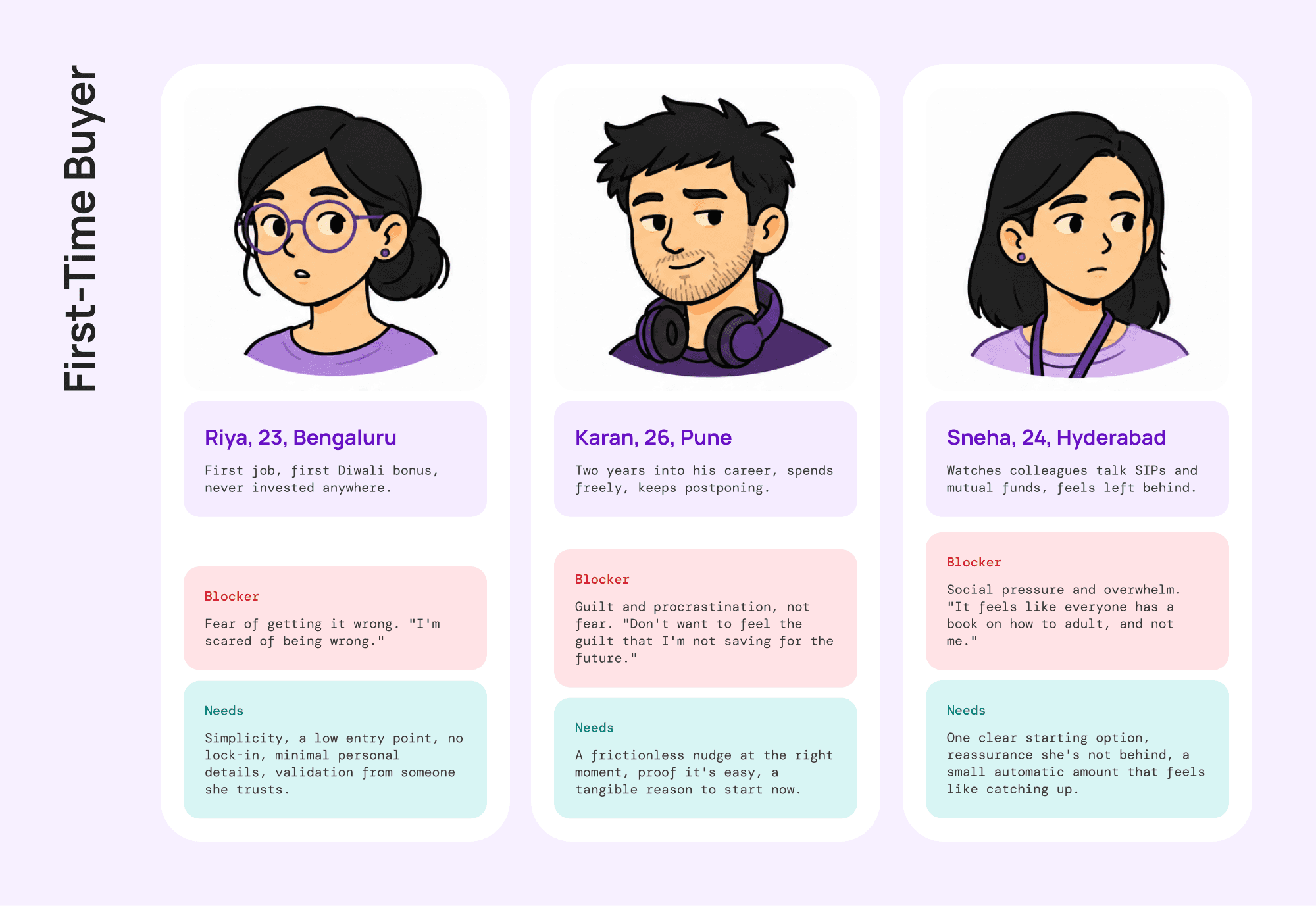
The label hides a lot. Riya froze on fear, investing felt like gambling. Karan froze on guilt, he'd put off saving for years. Sneha froze on social pressure, watching peers talk SIPs and feeling left behind. Three different reasons to freeze, one bucket.
Underneath, they wanted the same things: make it easy to start, let them begin small, keep the information clear, go easy on personal data, let them pull their money back out without a fight.
what the festive buyer said
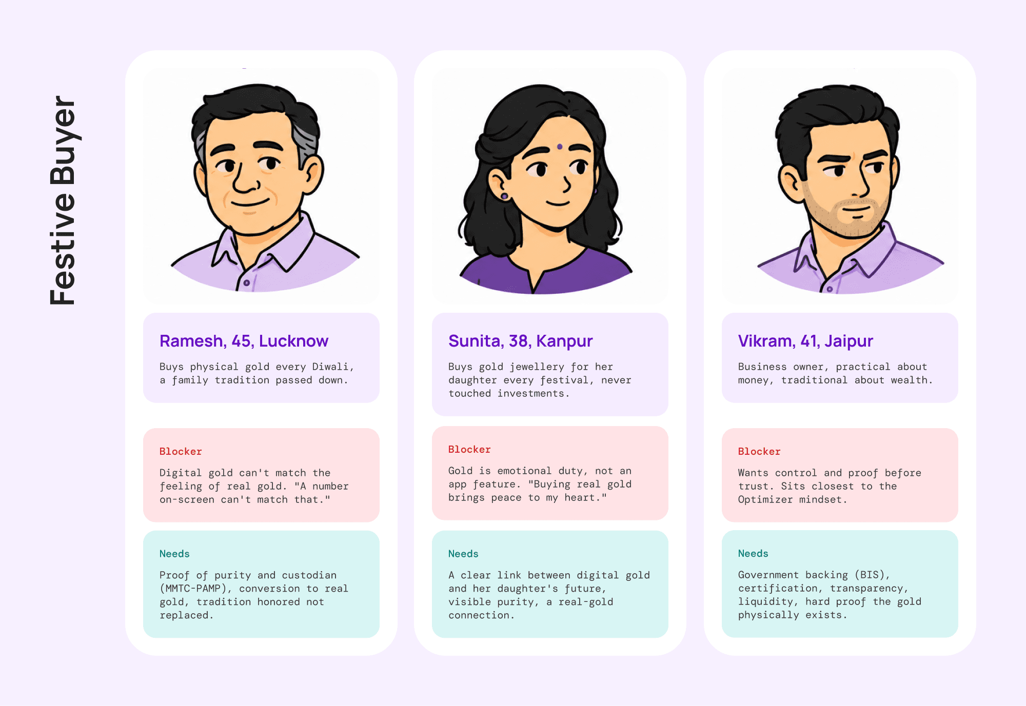
Ramesh and Sunita both needed proof that digital gold could still carry a duty owed to family. Vikram sat apart, wanting government backing and guarantees before anything else.
Their practical needs were sharper: does it convert back to real money or gold easily, is it government backed, where's it stored, who's responsible if something goes wrong. They've trusted physical gold their whole lives because it answers all of that on its own. Digital gold has to answer it out loud.
The emotional blocker told me what to say. The practical needs told me what to prove.
finding the belief under the complaint
I ran Five Whys on both groups to get past the surface friction. Take a complaint, ask why, then ask why again about the answer, until you hit something the user can't explain away.
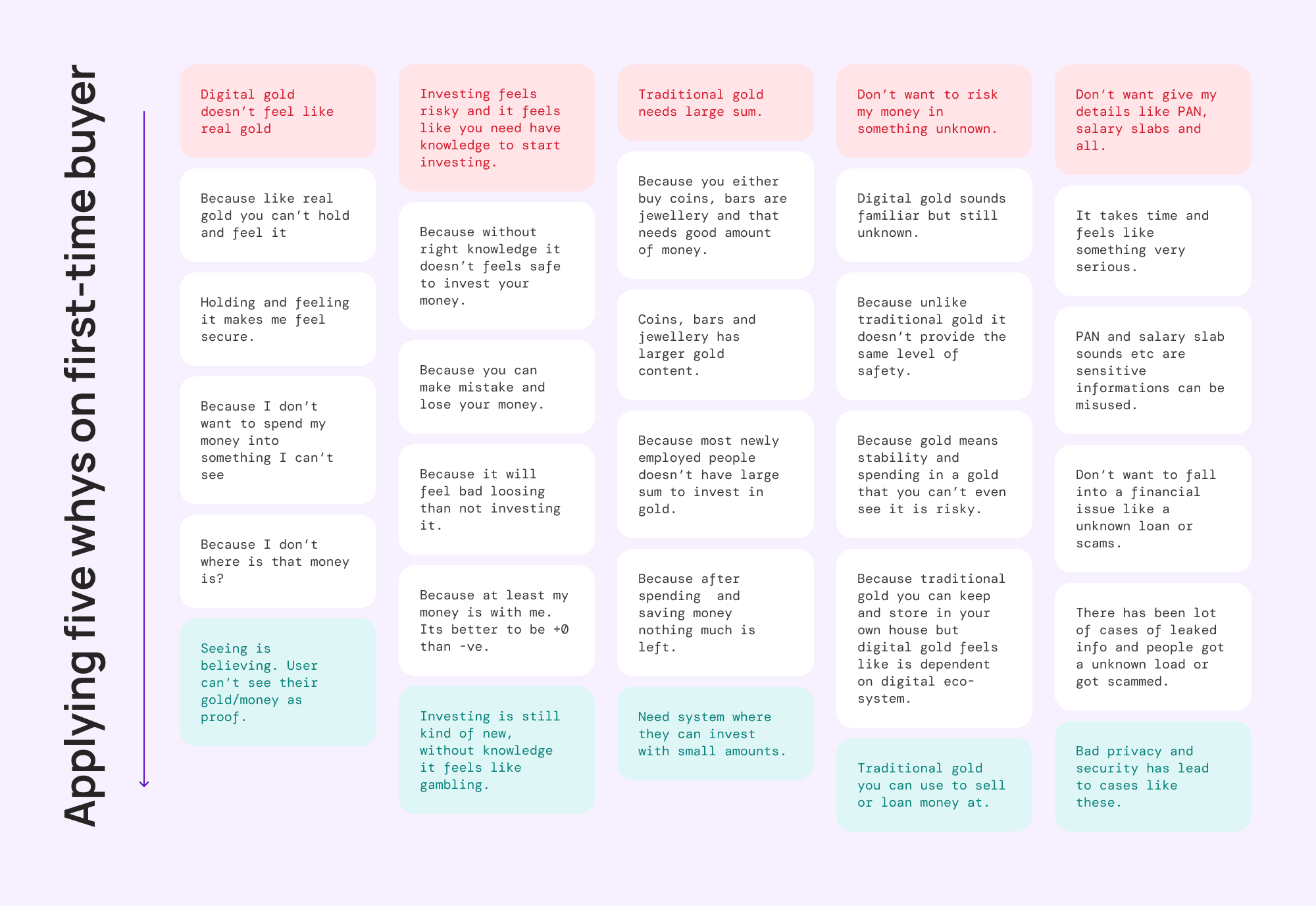
Every First Time Buyer chain bottomed out in the same place, seeing is believing. They can't see their gold, can't see their money, so they've got no proof anything is real.
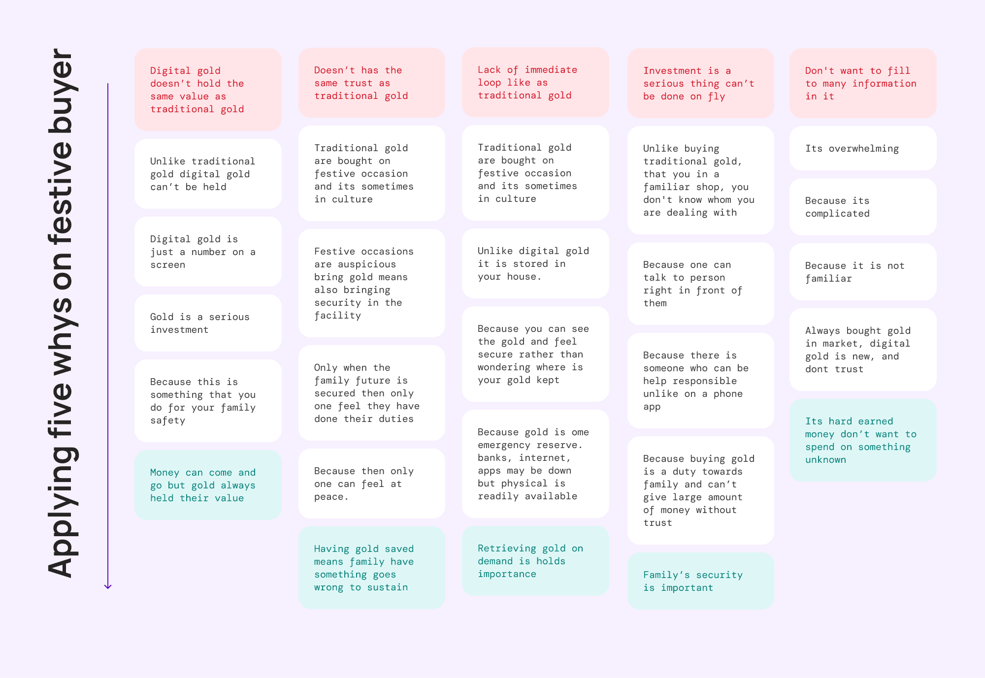
Every Festive Buyer chain rooted somewhere different, money can come and go, but gold has always held its value. For this group, gold is the one thing that survived every bank, every app, every bit of paperwork that ever failed them.
same blocker, different stakes
Not one root cause was about the product's features. Every single one was about trust, just two different flavours of it.
For the First Time Buyer, the risk is personal, getting a first money decision wrong with no experience to know if they've messed up until it's too late. For the Festive Buyer, the risk is inherited, failing a duty handed down through generations. Same blocker, same missing proof, but one is protecting themselves and the other is protecting something much bigger.
turning insight into a plan.
jobs to be done: what each persona is really trying to do
Five Whys told me what was true about each user. It didn't tell me what to build, that took two frameworks.
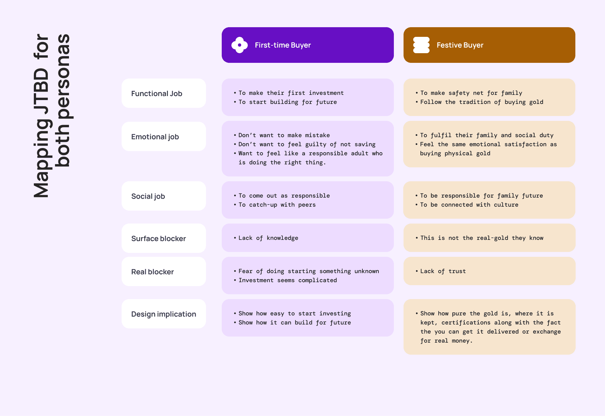
Jobs To Be Done split the blocker into what each persona was actually trying to do, feel, and be seen as. The row that earned its place was surface blocker versus real blocker. The First Time Buyer's surface blocker is "I don't know enough," but the real one is fear of starting something new. The Festive Buyer's surface blocker is "this isn't the real gold I know," but the real one is a lack of trust.
Two directions came out of that, ease and future for one persona, purity and proof for the other, and they became the backbone of every screen.
AIPSO: turning that into an onboarding plan
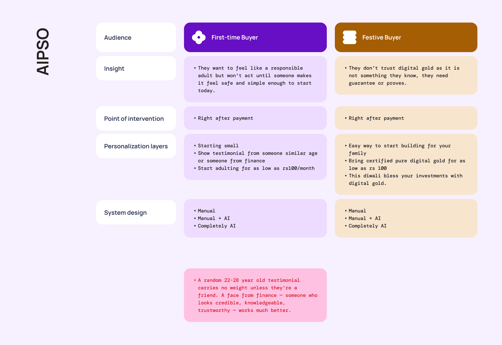
AIPSO came next, built specifically for onboarding rather than general design work: audience settled through JTBD, insight as the one-line blocker from Five Whys, point of intervention as the exact moment to step in, personalization as what changes per persona at that moment, and system design as how much of it runs on AI.
why I stopped at manual, no AI yet
That last layer is where I made a deliberate call. Three levels exist, manual, manual plus AI, and fully AI. I stopped onboarding at manual, on purpose.
I wanted the product thinking to stand on its own first, before any AI entered the picture. If a flow only works because something clever is generating the copy, it doesn't really work. Everything here is hand-built. The AI comes next, and it earns a whole case study of its own.

the entry point.
why right after payment
The point of intervention came from the workshop, not from me. Rajat had already established it, step in right after payment, when the user is in the highest trust state they'll be in, having just watched the app deliver exactly what it promised. I took that as a given and designed for it.
The research didn't fully agree though, Karan said a nudge right after spending would land, Ramesh said he'd ignore any banner the second a payment cleared. Both are right about themselves. It doesn't sink the decision, post-payment is still the strongest moment on average across both personas, just not a sure thing for either. I designed for what works best on average and let the AI layer in the next case study catch the rest.
the entry point on the success screen
Post-payment doesn't drop you straight into a full screen. A small nudge card shows up first, carrying the exact same headline that opens the flow, so you see what you're getting into before you tap in. No separate teaser, no bait and switch.

Instead of adding something new to the success screen, I changed something already there. The checkmark became a gold coin that still reads as confirmation but now plants the idea of gold the second the payment clears. A small "start gold savings" button sits in the corner for anyone ready to act. Same screen, doing a second job.
the messaging.
four headlines, one winner per persona
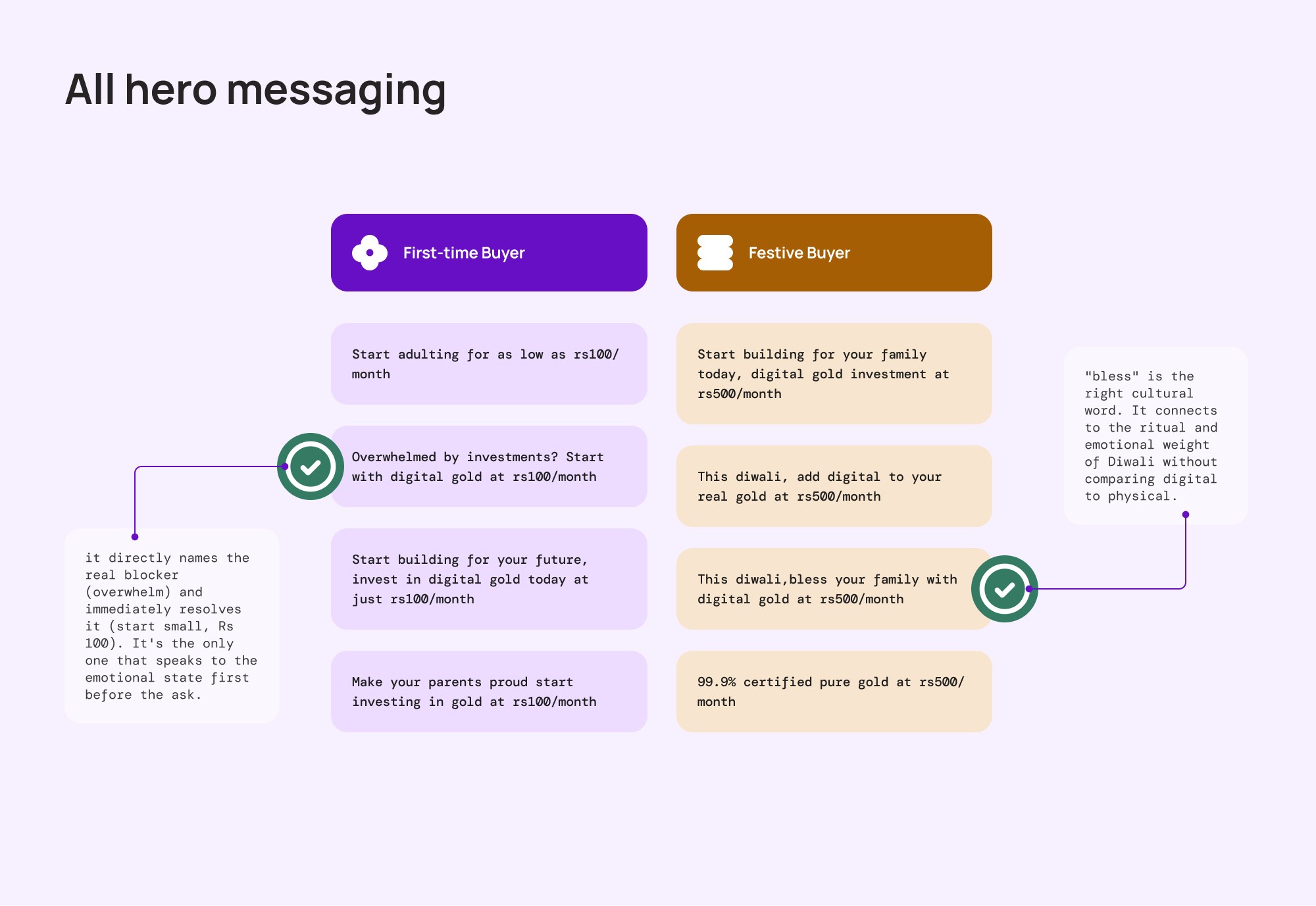
I wrote four headlines per persona and picked one from each.
First Time Buyer, chosen: "Overwhelmed by investments? Start with digital gold at Rs 100/month." It won because it names the fear before making the ask. The runners-up either skipped the fear or piled on pressure, one suggested "make your parents proud," which turns a private moment into a performance, exactly the wrong feeling for someone already nervous.
Festive Buyer, chosen: "This Diwali, bless your family with digital gold at Rs 500/month." Bless carries the ritual weight of Diwali without ever comparing digital gold to physical gold. A close runner-up, "add digital to your real gold," almost worked, but "real" quietly implies digital isn't, which undercuts the entire trust argument, so I killed it.
why the amounts were Rs 100 and Rs 500
Rs 100 for First Time Buyer is just the platform floor, not a clever middle ground. Someone early in their career already spends more than that in a day, and the fear here is overcommitting, not the amount.
Rs 500 for Festive Buyer was an actual choice, reasonable inside a season they're already spending heavily in.
version one: one line per screen
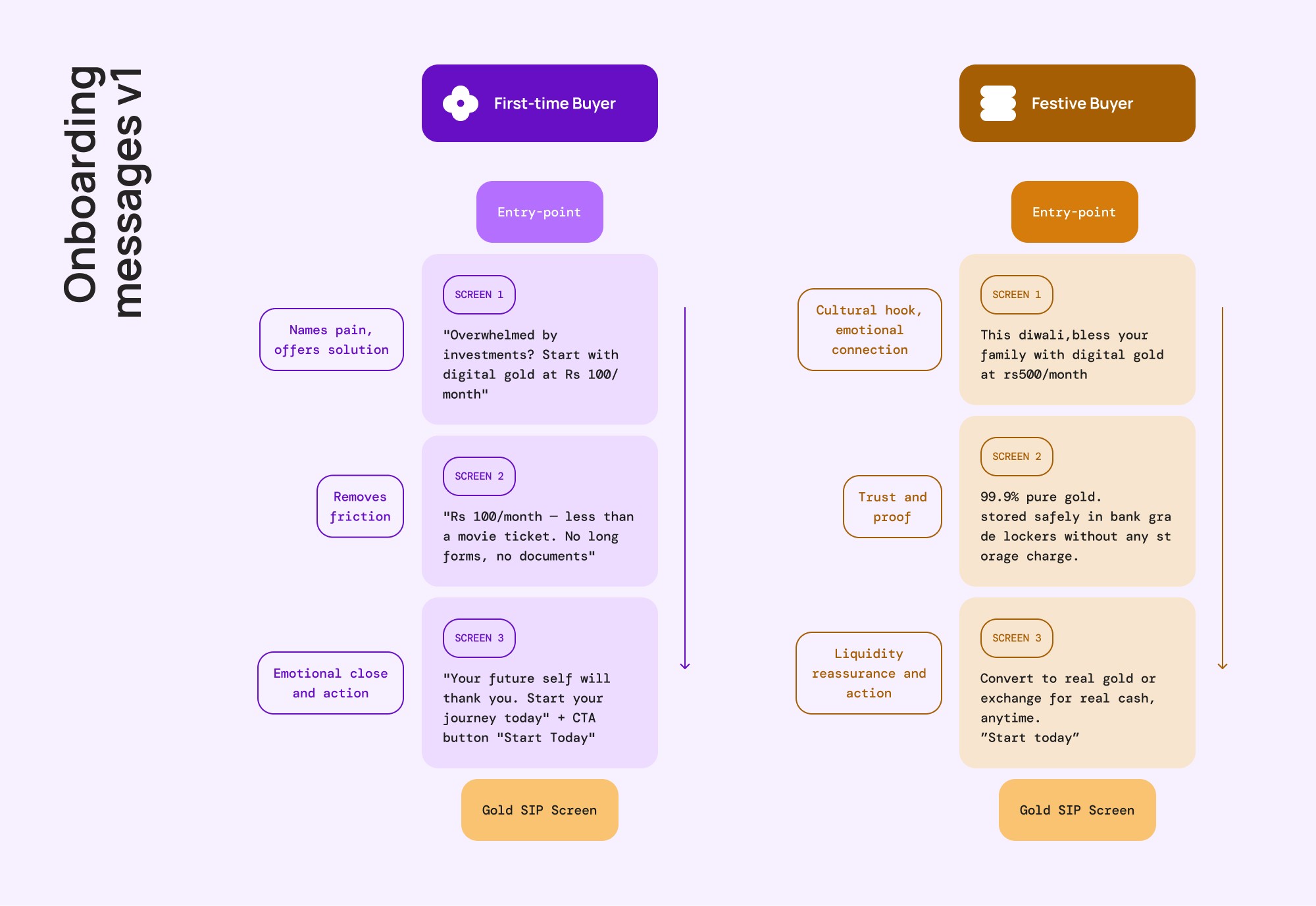
Version one of the supporting copy was one line per screen, each doing a single job, name the pain, offer the fix, close on emotion. Clean, but too clean.
Held against the shared root, the problem was obvious. Both personas were being asked to hand real money to something they couldn't see or touch, and one line of reassurance isn't proof, it's a promise, the exact thing neither persona was willing to take at face value.
version two: more proof, placed where it's needed
Version two didn't change what each screen was trying to do, it changed how hard each one had to work to prove it. More trust signals, placed where each persona actually needed them: withdraw anytime, 99.9% certified pure gold, no lock-in, stored and insured by MMTC-PAMP, the 1.5 crore users stat.
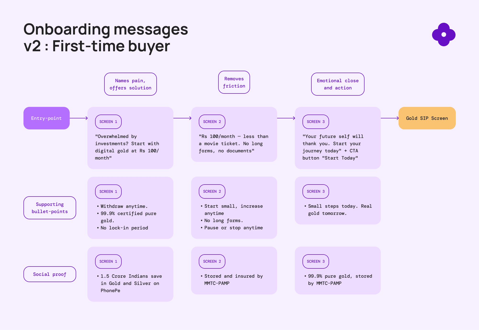
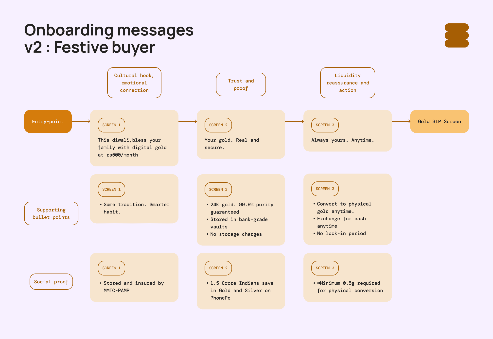
One choice worth pulling out, the Festive Buyer's second screen carries more proof than any other screen in either flow, deliberately. This is the persona protecting a family's history, not just their own money, so the screen that had to win their trust had to pull more weight than anywhere else.
building it in gray.
same structure, different pace of CTAs
Same stepper, same three-screen skeleton, same layout for both personas. What changes is tone, and most of that lives in the CTAs.
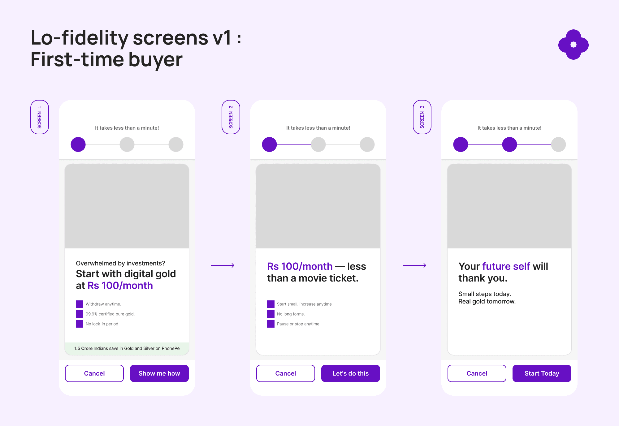
The First Time Buyer climbs slowly, "Show me how," then "Let's do this," then "Start Today," each tap asking for a little more than the last, which suits someone who needs to feel their way in.
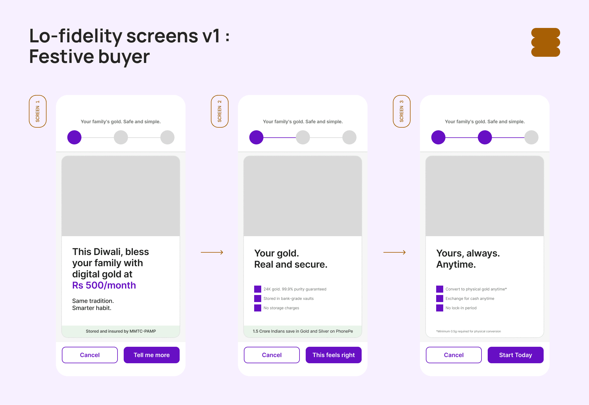
The Festive Buyer covers the same ground faster, "Tell me more," then "This feels right," then "Start Today." Their trust builds through proof, not small steps, and that proof already did its job by screen two.
why illustrations stayed gray
Illustrations stayed as gray placeholders here, on purpose. This version exists to prove the structure and the copy hold up on their own, before any visual polish gets a chance to cover for a weak flow.
finding people without asking them
the routing problem
The Festive Buyer in this demographic mostly buys gold in cash, from local jewellers, not through an app. So their PhonePe history won't show gold purchases even though they're exactly who this flow is for.
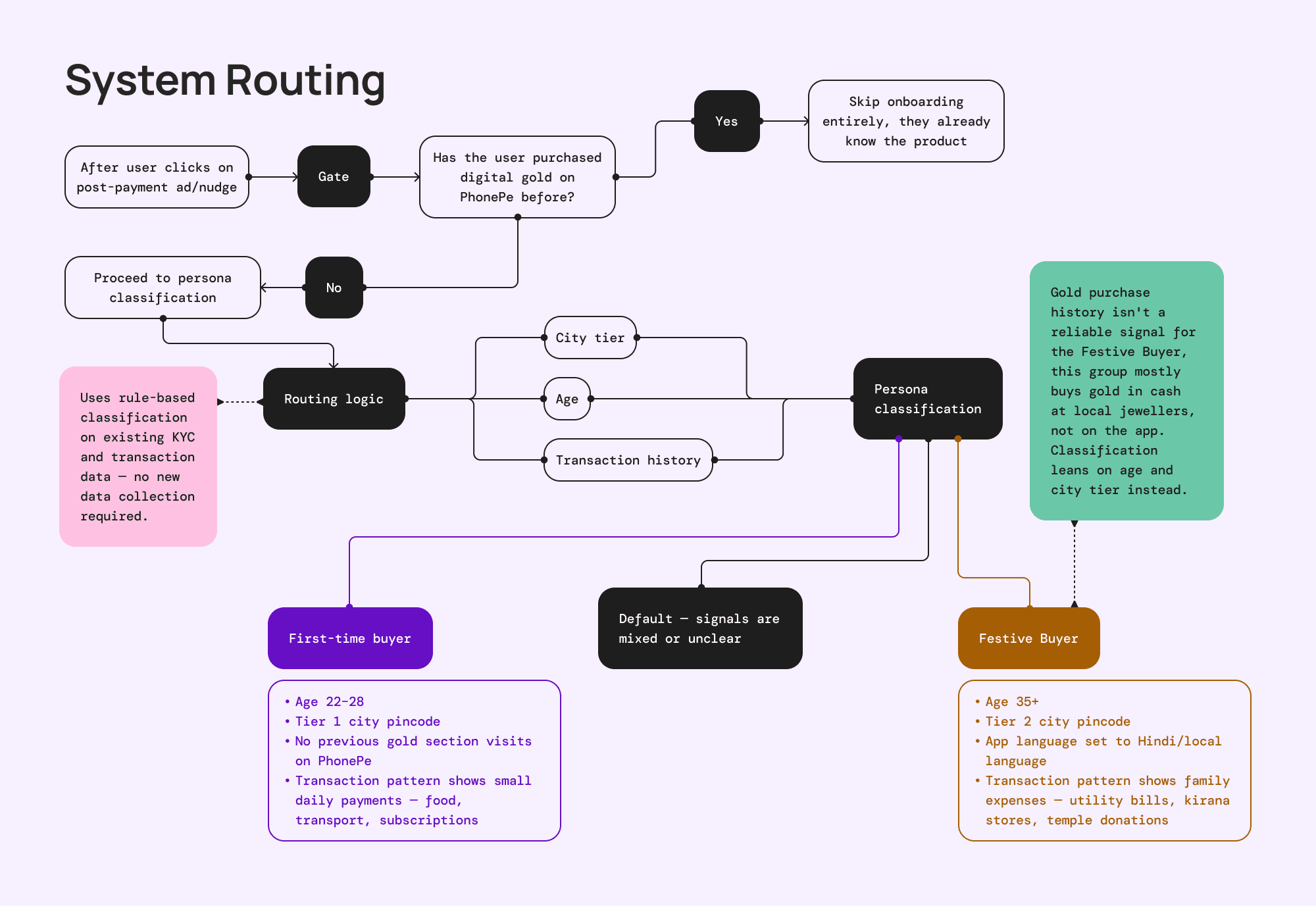
how routing actually works
Routing leans on other signals instead, age, city tier, and spending patterns already sitting in KYC and transaction records. A gate goes first, if someone's already bought digital gold here, skip onboarding entirely, they already know the product. If not, classification runs on those signals, no new permissions, no new forms.
First Time Buyer reads as age 22 to 28, tier-1 pincode, no prior gold section visits, small daily spends like food and transport. Festive Buyer reads as age 35 and up, tier-2 pincode, app language set to Hindi or a local language, spending skewed toward family, utilities, and temple donations. Anything that matches neither pattern drops to a generic flow, out of scope here.
the reviews.
the PM review: three things that mattered
The PM review ran as a senior PhonePe product manager with fintech and SEBI compliance experience, against sixteen items. Three mattered.
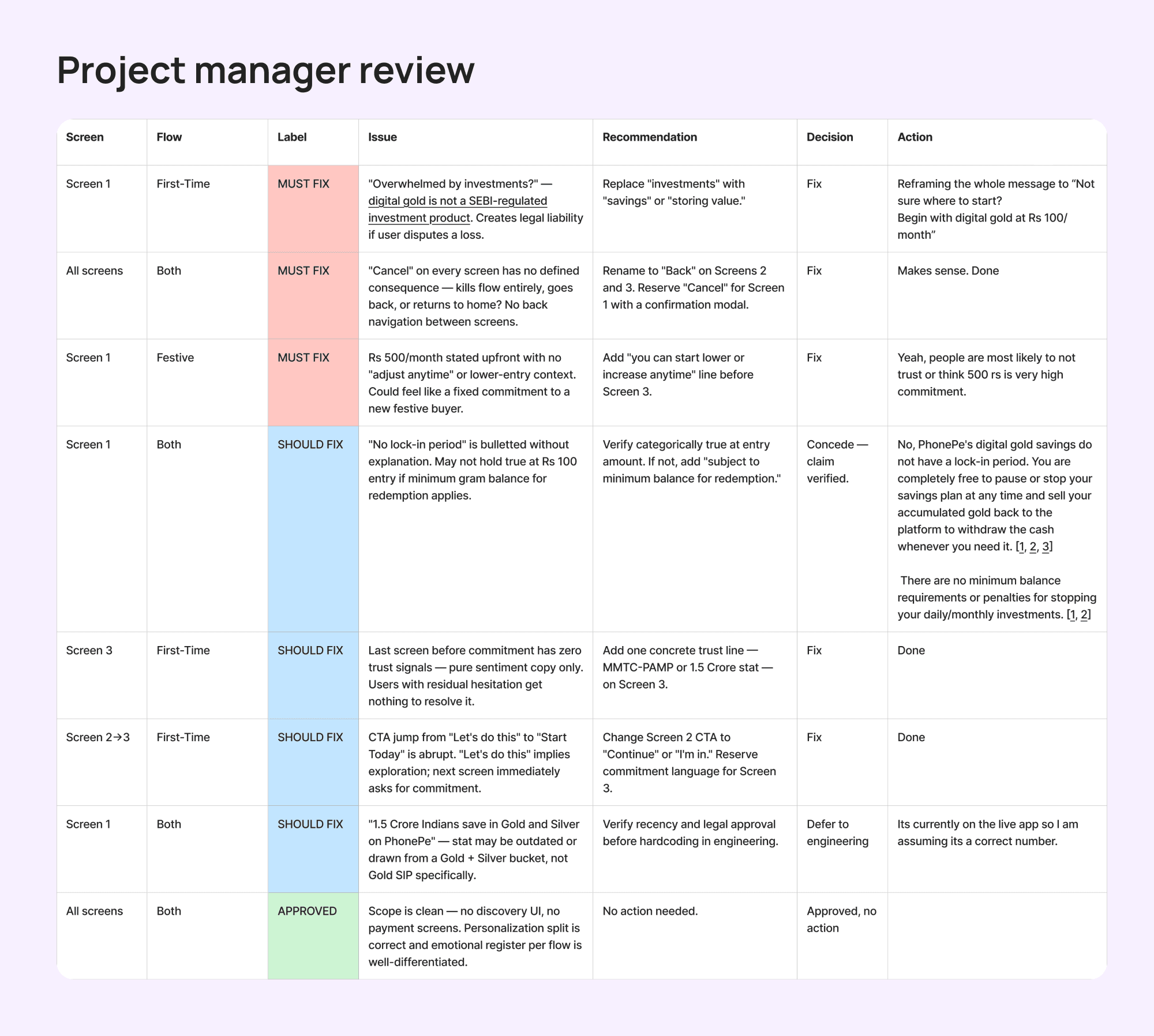
"Overwhelmed by investments" got flagged must-fix, digital gold isn't a SEBI-regulated investment product, and that word creates real legal exposure if a user ever disputes a loss. I reframed it to "Not sure where to start? Begin with digital gold at Rs 100/month," same emotional beat, no regulatory risk.
"No lock-in period" got flagged as unverified. Instead of softening the copy to play it safe, I checked the claim against the actual product, no lock-in, no minimum balance for redemption, confirmed, not assumed. The copy stayed.
Rs 500 stated flat read like a fixed commitment, so I added one line before screen three, you can start lower or increase anytime, removing the locked-in feeling without weakening the number.
the EM review: three things that mattered
The EM review ran as a senior engineering manager with payments experience, against sixteen more items, then a second PM pass checked whether each fix actually held up.
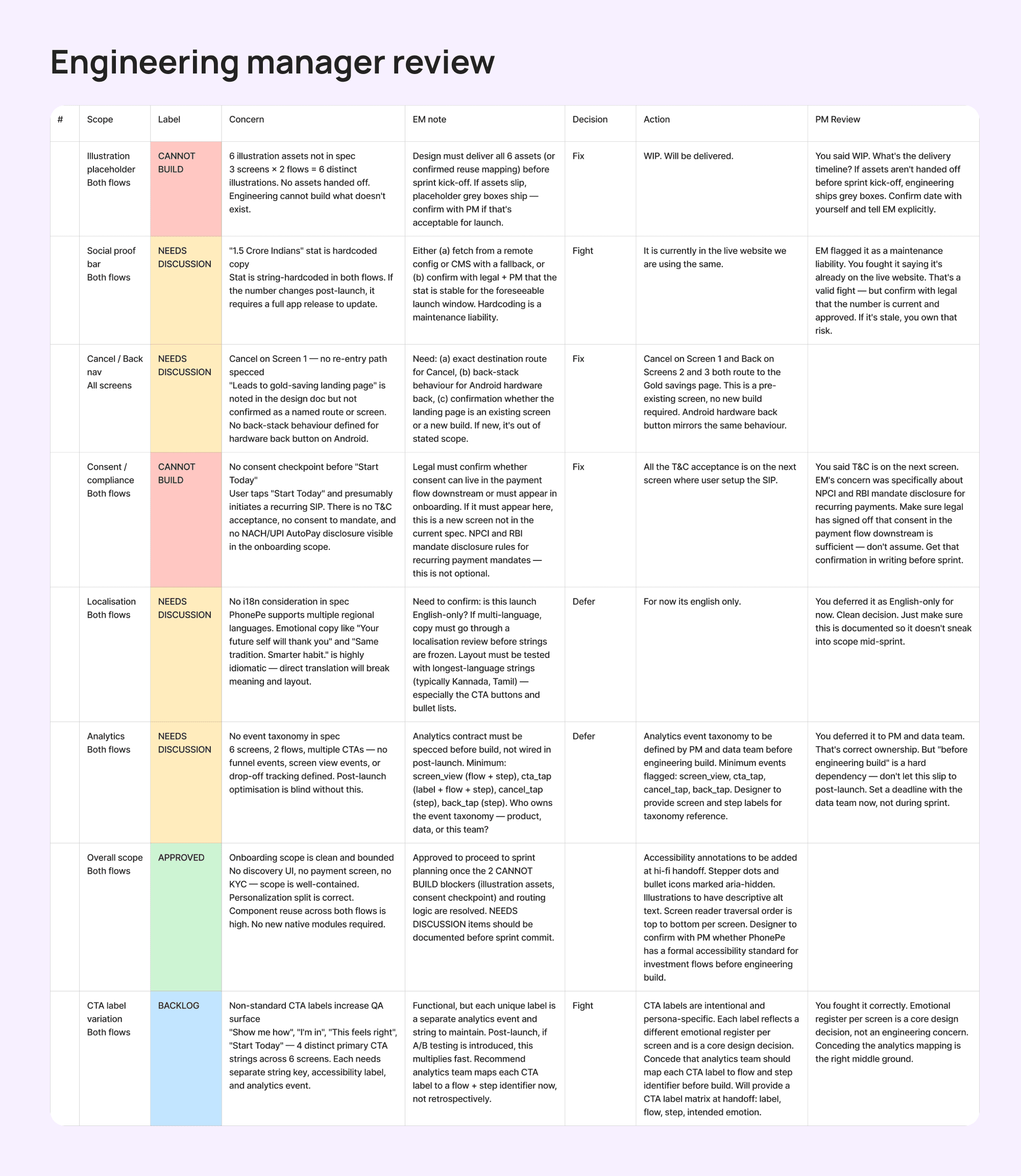
The "1.5 crore users" line got flagged as hardcoded, a maintenance risk if the number ever changes. My pushback was that it's already live on PhonePe's own site today. The PM's second pass accepted it but attached a condition, confirm with legal it's current, and if it goes stale, that risk sits with whoever fought to keep it.
The four different CTA strings got flagged as unnecessary QA surface. My pushback was that each label is a different emotional register per screen, that's the design, not overhead. The trade I accepted was that analytics needed every label mapped to a flow and step ID before build.
One item is still open on purpose. There's no T&C acceptance or mandate disclosure anywhere in onboarding. I resolved it by pointing downstream, consent lives on the SIP setup screen, but the second pass wouldn't call that settled, NPCI and RBI have specific rules for recurring payment mandates. The instruction was blunt, get it confirmed in writing before sprint. I'm leaving it open, because it genuinely is.
making it feel like it was always there.
matching phonepe's design system
Lo-fi shipped in gray, and both reviews ran against it. Hi-fi is where those fixes landed and everything got its real skin. Typography and iconography matched PhonePe's existing scale rather than being invented, so nothing feels bolted on, the goal was a user never noticing the seam between onboarding and the rest of the app.
matching phonepe's design system
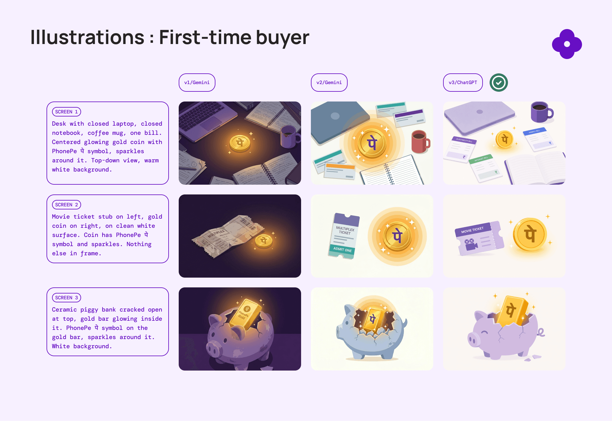
The illustrations were built as a system, not six one-offs. I fed real screenshots of the live app into Gemini and ChatGPT so the output matched their actual style, flat vector, slightly volumetric, warm backgrounds, one hero object per frame, every gold coin carrying the पे symbol, gold staying the brightest thing in every frame.
First Time Buyer got the everyday world, a desk with a bill and a coin, a movie ticket beside a coin, a cracked-open piggy bank.
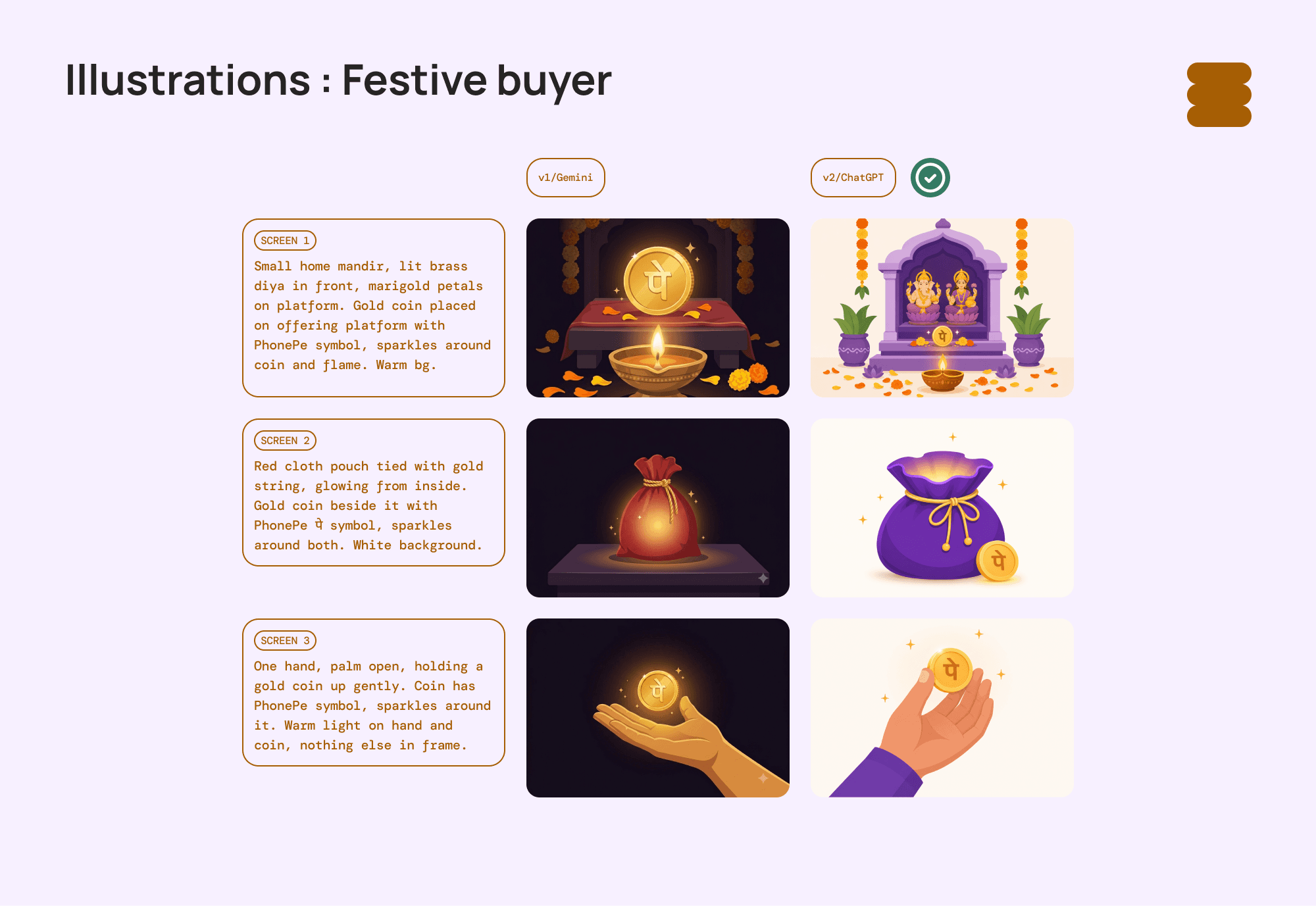
Festive Buyer got the cultural one, a home mandir with a diya, a red cloth pouch, an open palm holding a coin.
the correction pass
The first pass ran on Gemini and didn't hold up, screen one's desk came back too cluttered and too realistic. I cut objects, flattened the shading, simplified the coin edge, then moved to ChatGPT for the final set, and re-ran that same fix across the festive frames instead of assuming they'd carried over clean.
Scroll to the gallery below for the finished screens, or walk through the working prototypes:
where this leaves off.
The onboarding is built, and built by hand. Every screen, every line of copy, every routing rule is traditional product thinking, no AI in the product itself. That was the point, prove the thinking holds on its own first.
Staying manual was a deliberate stop, not a limit. Rajat framed onboarding as a three-level ladder, fully manual, manual assisted by AI, fully AI. This is Level 1, on purpose.
Words have a limit though. A user can read every proof point and still hesitate at the moment they're meant to commit, because they still can't see it. That gap is where PAI comes in, a layer that catches them right as they're about to leave and shows them what their savings could actually grow into. That's the next case study.
year
2026
timeframe
21-days
tools
Figma, Claude, Gemini, ChatGPT
category
AI Assisted/Concept
01

02

see also


