jaatre
An UI/UX redesign of Jaatre — an online event platform for conferences, webinars, and seminars. Fresh face, same functionality, built to compete.
00

problem
Jaatre was a massive online event platform — sessions, speakers, networking, expo booths, and meeting lounges all in one place. The functionality was all there. The experience wasn't. The brief: give it a fresh face while keeping its existing functionality and demographic intact.
solution
A redesigned interface built on a restructured information architecture, a refined visual system and a cleaner design system that brought everything hidden to the surface.
Jaatre wasn't a new product, it was a working platform with real users, real events, and a lot of existing complexity. Our job wasn't to reinvent it. It was to make it look and feel like it belonged next to the platforms it was competing against.
Before this project, we had already done the branding and website for Jaatre, so by the time we got to the app redesign, we understood the brand, the product, and what they were trying to build.

What the platform had
Jaatre wasn't a new product, it was a working platform with real users, real events, and a lot of existing complexity. Our job wasn't to reinvent it. It was to make it look and feel like it belonged next to the platforms it was competing against.
Before this project, we had already done the branding and website for Jaatre. so by the time we got to the app redesign, we understood the brand, the product, and what they were trying to build.
What was getting in the way
The original design was complicated. Functionalities existed but were buried — extra steps for simple actions, things hidden that should have been visible, and an interface that felt overwhelming the moment you landed on it.
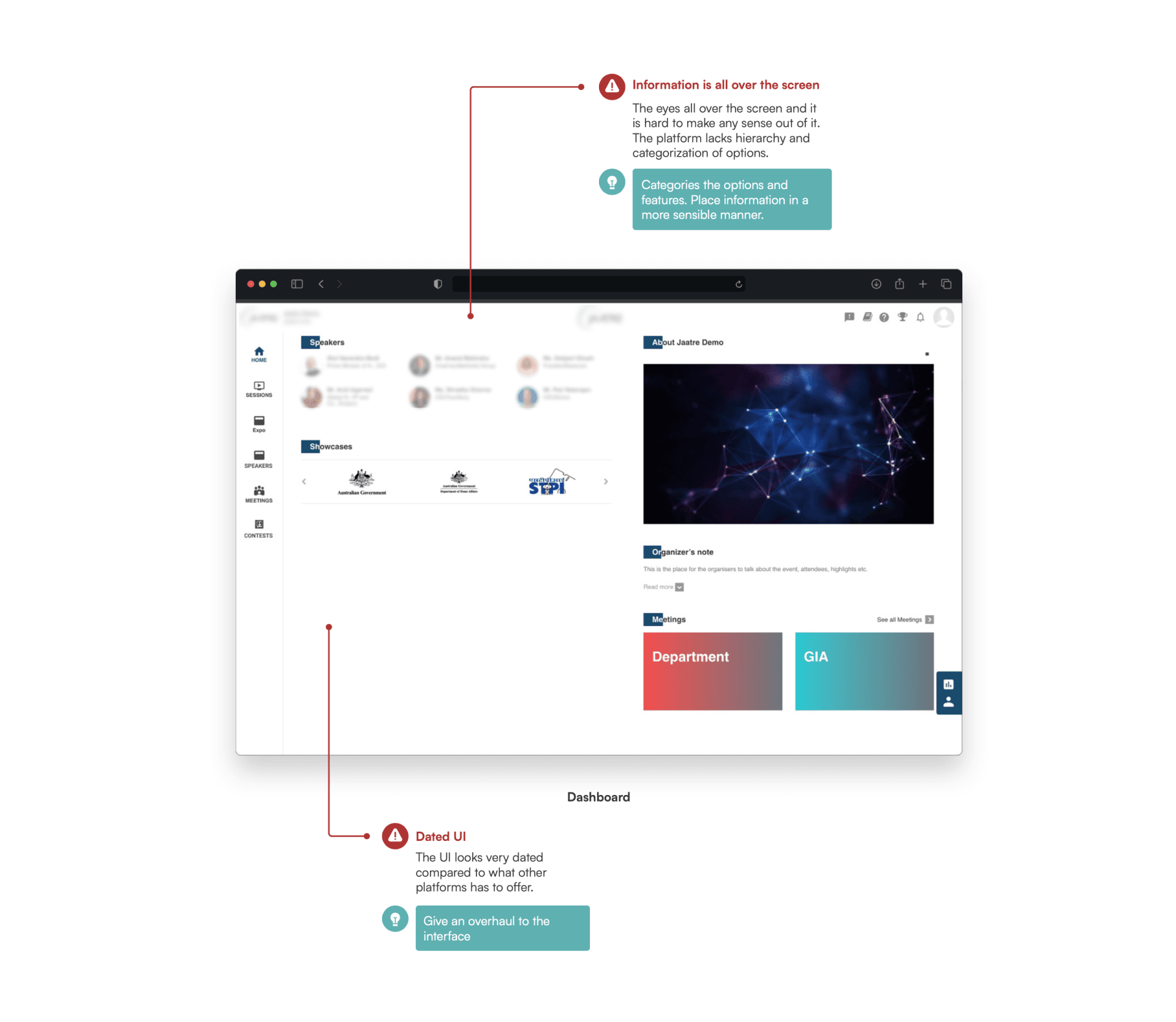


Key issues: Information overload on the dashboard, a hidden view tab, limited seat visibility with no clear joining flow, and too many sponsors crowding a single panel.
What was worth keeping
Most of the pages were structurally fine, they just needed to be tidied up and reordered. We weren't here to tear everything down.
The scorecard
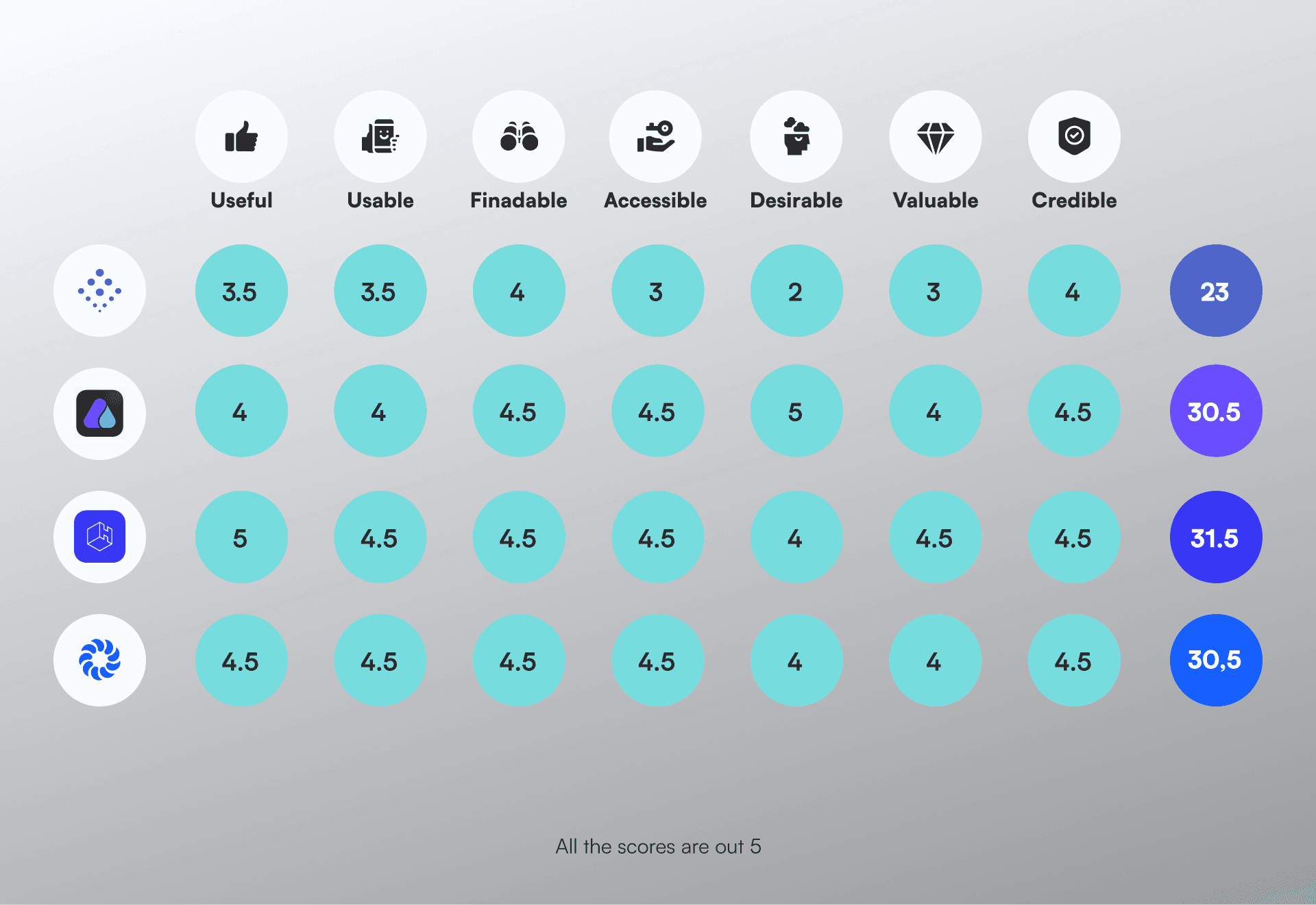
We rated Jaatre against Airmeet, Hubilo, and Hopin across usability, findability, desirability, credibility, and UI design. The original design scored poorly across the board, confirming that UI design and accessibility were where we could make the most impact.
Looking beyond the category


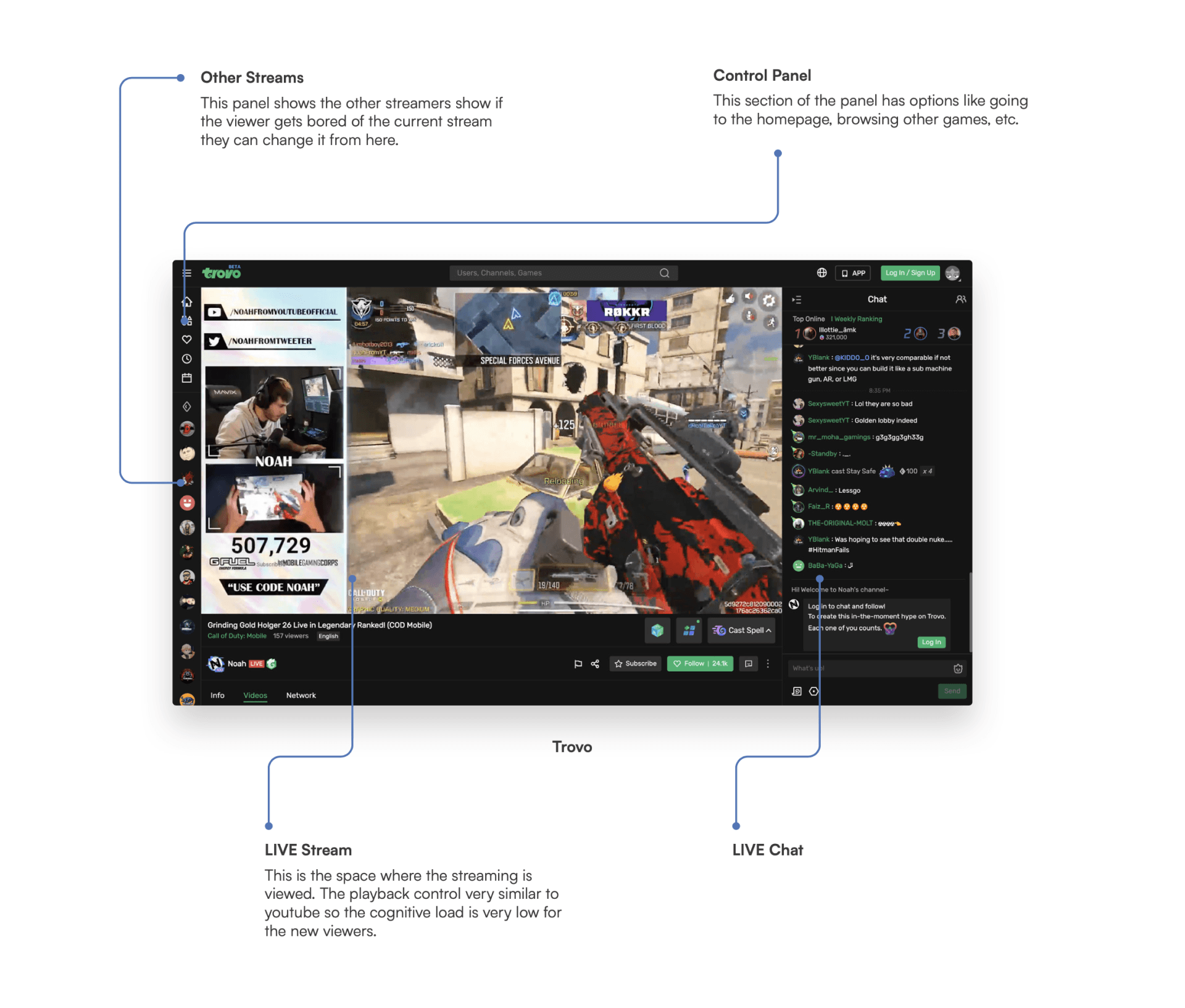
We also studied platforms that handle content-heavy live interfaces well : Discord, Trovo, and YouTube Live. What they have in common: content centre-stage, controls on either side. That layout logic directly influenced the redesigned session screens.
Starting over with the sitemap

We rebuilt the sitemap from scratch, creating a cleaner hierarchy that surfaced sessions, meetings, expo, and networking at the top level while keeping settings and profile management accessible but out of the way.
Deciding what to build
A Value vs Effort matrix helped us prioritise.

Features we built: dark and light mode toggle, improved session joining flow, cleaner sponsor panel, profile dropdown redesign, and a restructured dashboard.
Features we deferred: language switcher, advanced filtering, and several new feature ideas that would have required significant development time we didn't have.
Setting the tone
The platform already had brand guidelines from the earlier branding work, so the visual direction had to feel consistent while being significantly more refined. We studied how interfaces look across both dark and light settings before committing.
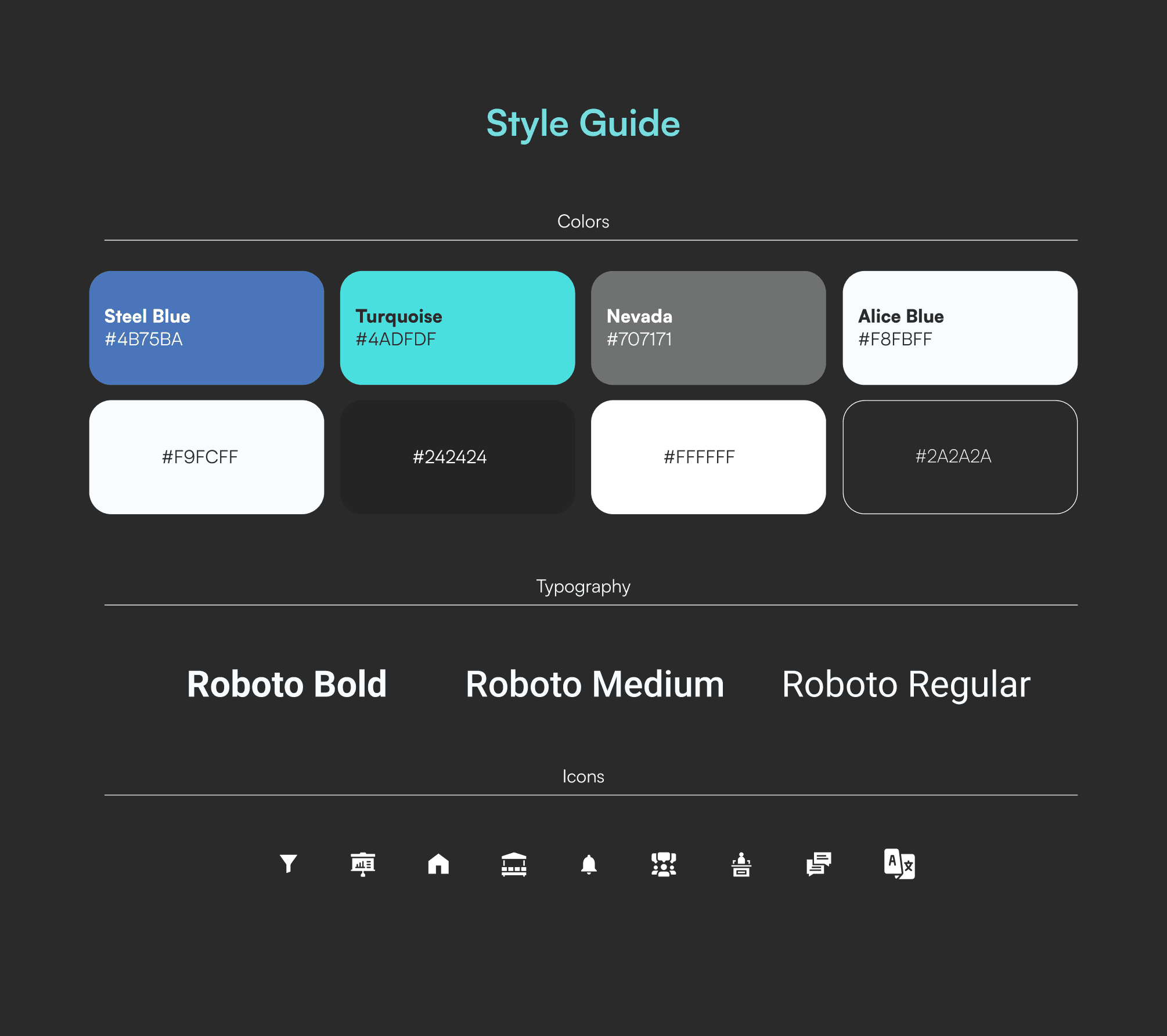
The design system
We introduced a three-mode visual system — light, dark, and auto. Roboto across three weights, a Steel Blue and Turquoise palette, and a tight custom icon system. This was also the first project at the company where we made the switch from Adobe XD to Figma.
The final screens
The final design covered every major screen — the dashboard, live session pages, meeting tables and lounges, expo and booth pages, and the speaker directory with detail panels.
How it ended
The project was completed during our internship. Jaatre went out of business shortly after, the redesign never launched. But the process was complete and the output was real.
The Impact
A platform that went from struggling to compete visually to looking like it belonged at the top of the category.
Full end-to-end process: discovery, research, competitive analysis, problem identification, Value vs Effort prioritisation, new sitemap, sketches, lo-fi prototypes, visual research, style guide, and final high-fidelity screens. Everything documented, everything delivered.
Trade-offs
The Value vs Effort matrix kept us disciplined — several features were deprioritised because the timeline couldn't support them. That constraint kept the core experience tight.
Mobile design was not in scope. At the time, conference attendance was primarily happening on desktop and tablet — so we prioritised those experiences and left mobile for a future phase that never came.
The platform never launched. That's the one thing this case study will always be missing.
What i would have done differently
Designed mobile from the start rather than leaving it for a future phase that never came.
Built a proper design system before jumping into screens — we were new to Figma and figuring it out as we went, which cost us consistency and time.
Involved development earlier so technical constraints didn't surface only at handoff.
year
2021
timeframe
8 weeks
tools
Figma, Illustrator
category
UI/UX
01

02

03

04

05

06


