healthybarks
A full website redesign and design system for HealthyBarks — a Bengaluru-based fresh dog food startup. From broken prototype to Shopify e-commerce platform, with an 8% sales increase after launch.
00

problem
The existing site looked broken — inconsistent, not mobile friendly, and doing nothing to communicate what made HealthyBarks different. Pet parents landing on the website had no clear reason to trust it, let alone buy from it. The goal: build a website that told the HealthyBarks story clearly enough to convert visitors into customers.
solution
A fully redesigned website built on an atomic design system — covering homepage, shop, product pages, about, success stories, and consultation flow. Designed as an education-first experience: before asking pet parents to buy, the website teaches them why their dog's current food is falling short and how HealthyBarks fills every gap. Migrated to Shopify with a specialist agency, where the design finally came together and delivered results.
The website was designed as a knowledge hub as much as a shop. Before asking anyone to buy, it educated pet parents — on how kibble is made, why home cooked food falls short, and how HealthyBarks fills every nutritional gap. Dedicated pages for redefining pet food, how to feed, and success stories gave pet parents the full picture. By the time they reached the shop, they weren't just browsing — they understood why they were there. That combination of education, honest positioning, and clean design is what drove the results.

Expanding the brand and establishing a visual language
Building on what existed
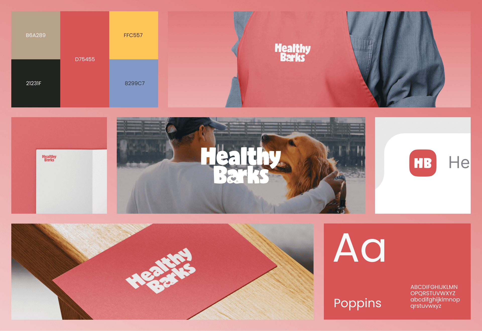
The branding — logo, colours, basic guidelines — was already in place when I joined. My job was to expand it into a full visual language for the website: how the brand speaks, what it looks like in context, and how every element works together across pages.
The illustration debate
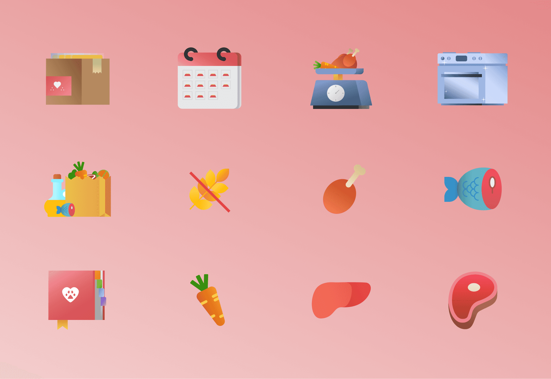
One of the early decisions was whether to use photography or illustration. I pushed for illustration — we were targeting the Indian market, good Indian dog photography didn't exist yet, and a custom illustration style would give the brand a warmer, more distinctive feel.
We landed on a mix of both. I developed a flat illustration style with gradient depth — simplified, accurate, and warm. It felt right for a food brand trying to build trust with pet parents.
The design system

Once we had aligned on the visual direction, I built a full atomic design system — colours, combinations, typography, spacing, layout guidelines for desktop and mobile, component library, and a visual language guide covering image and illustration usage. It gave the project the consistent foundation it needed to move forward.
What we were designing for
More than a shop
HealthyBarks wasn't just an e-commerce store — every product was calibrated to the dog. Even the ready-to-buy SKUs were segmented by life stage and size: puppies, adult dogs, medium breeds. The custom consultation option stayed live throughout, for pet parents who wanted meals designed specifically for their dog's needs.
The product range covered fresh meals, boosters — nutrient-rich add-ons to mix into existing home-cooked meals — bone broth, dehydrated treats, and frozen treats.
The story we needed to tell
The core message was a difficult one to land: what most pet parents feed their dogs every day is slowly harming them. HealthyBarks was the alternative — expert formulated, balanced, convenient. Getting that message across without being preachy was the real design challenge.
From custom meals to e-commerce
What changed
The original model — custom meals filled via a form — wasn't converting at the scale the business needed. The team made the decision to move to a full e-commerce model while keeping the custom consultation option available for pet parents who wanted it.
Shopify changed everything
The pivot came with a decision to move to Shopify and bring in a specialist agency. That was the turning point. For the first time, the design was being executed by a team with the right expertise. We agreed on a theme, I adapted the design system to fit it, and the website finally started looking and functioning the way it was meant to.
How it came together
The photo shoot
We organised a proper photo shoot — real products, real ingredients, real dogs. Combined with the Shopify migration and the refined design, the website finally had the visual quality the brand deserved.
The storytelling layer
On the homepage we added a direct comparison — HealthyBarks vs kibble vs homemade food — making the case for fresh food in a single scroll. Dedicated pages for fresh meals, boosters, and success stories gave pet parents the context and confidence to buy. That combination of honest positioning and clean design is what drove the results.
Conclusion
The Impact
8% increase in sales after the Shopify launch — driven by a cleaner design, better storytelling, stronger photography, and a website that finally worked the way it was supposed to.
A full atomic design system delivered. A custom illustration style developed from scratch. Every page of the site redesigned across a year of iteration, pivots, and cross-functional collaboration.
Trade-offs
The design system was built with Helvetica — but when we moved to Shopify, the entire design had to be adapted to Poppins to fit the theme. Most of the original design work was effectively rebuilt from scratch.
The illustration style I developed was never fully carried forward. It was minimised after a junior graphic designer joined the team, and maintaining visual consistency without the right handoff process became harder than it should have been.
The website never reached its full potential. HealthyBarks ran out of funding in early 2023 and shut down before the vision was completely realised.
What would have I done differently
Pushed for Shopify from the beginning rather than spending months working around an underpowered development setup.
Built the design system in the final chosen font from day one — rebuilding everything for Shopify cost significant time.
Done the photo shoot earlier — the visual quality jump it created should have happened at the start, not midway through.
year
2021–22
timeframe
12 months
tools
Figma, Zeplin, Shopify
category
UI/UX
01

02

03

04

05

06

07

08


